Well, here’s a surprise – a new one-shot starring Jon Kent and Damian Wayne. I don’t know why the the Super Sons title has been set aside, Damian and Jon have established their brand, and no matter that Superboy is now Superman, they’ll always be the Super Sons. Heck, when I saw the name of the comic – in a terribly unprepossessing font, why not just use the logos? – I wondered what Clark was doing teaming up with Damian. I guess we do need that ‘Son of Kal-El’ qualifier, after all.
Anyway, here’s Jon and Damian in a new, current day adventure, showing that no matter that Jon is now a few years older than Damian, the minute they get together, the old chemistry is there.
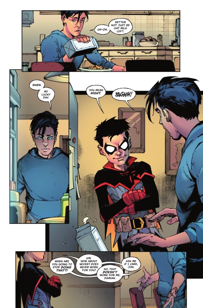
It’s a school night but Damian knows an alarm has gone off in the Fortress of Solitude, and he’s here to help. How does he know before Jon?
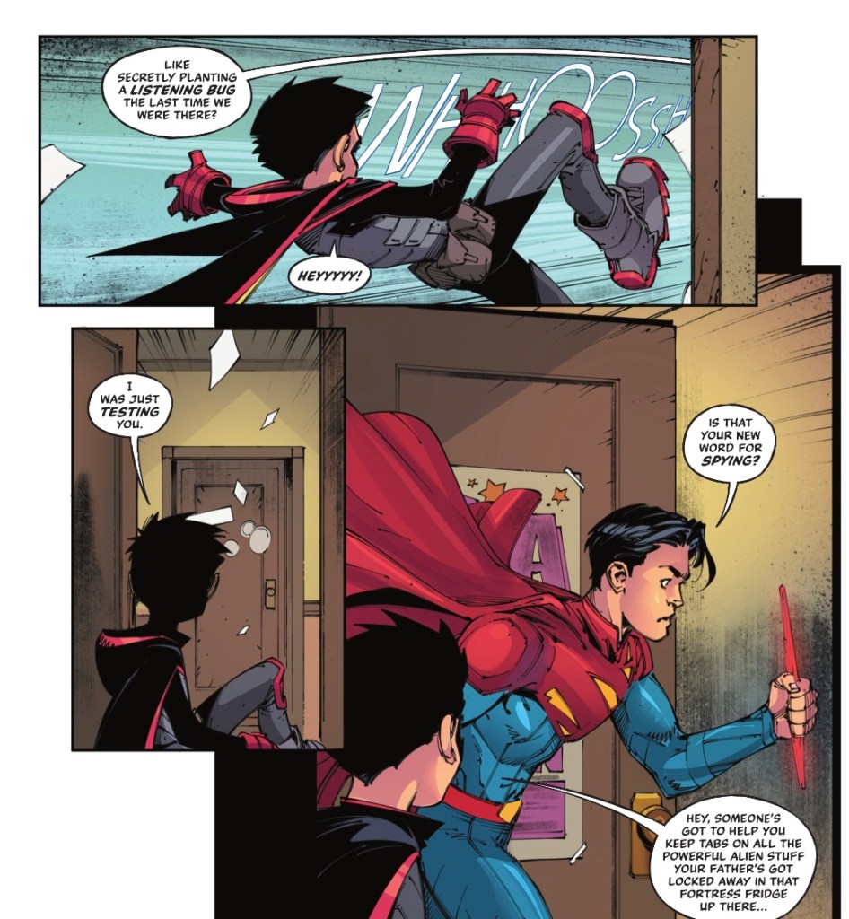
Jon’s annoyance doesn’t last long, as he and Damian fly to the Arctic to investigate the possible Fortress break-in.
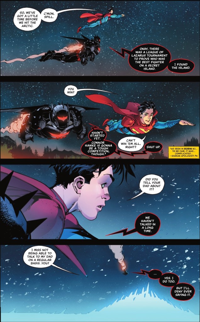
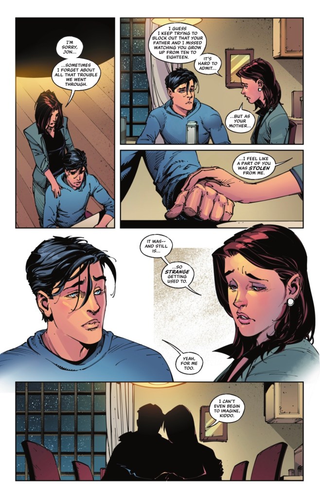
That’s a great moment. Despite the fact that both Damian and Jon have solo books, they’re never as human, as appealing, as when they’re together, under the pen of Peter J Tomasi. It’s not the only poignant part, there’s a lovely scene between Jon and mom Lois.
Of course, the story doesn’t stint on fun, with page after page of terrific back and forth dialogue between the Super Sons as they discover what’s going on at Superman’s secret sanctuary. There are callbacks aplenty to previous Damian and Jon tales, with fun notes from editor Paul Kaminski ensuring that no one gets lost.
Making his Super Sons debut, Viktor Bogdanovic provides cheery pencils – there are melancholy moments, and they’re well-done, but a smile is never far from the faces of our young heroes, while the action scenes are well whoop-worthy. My favourite panel in the issue is a splash.
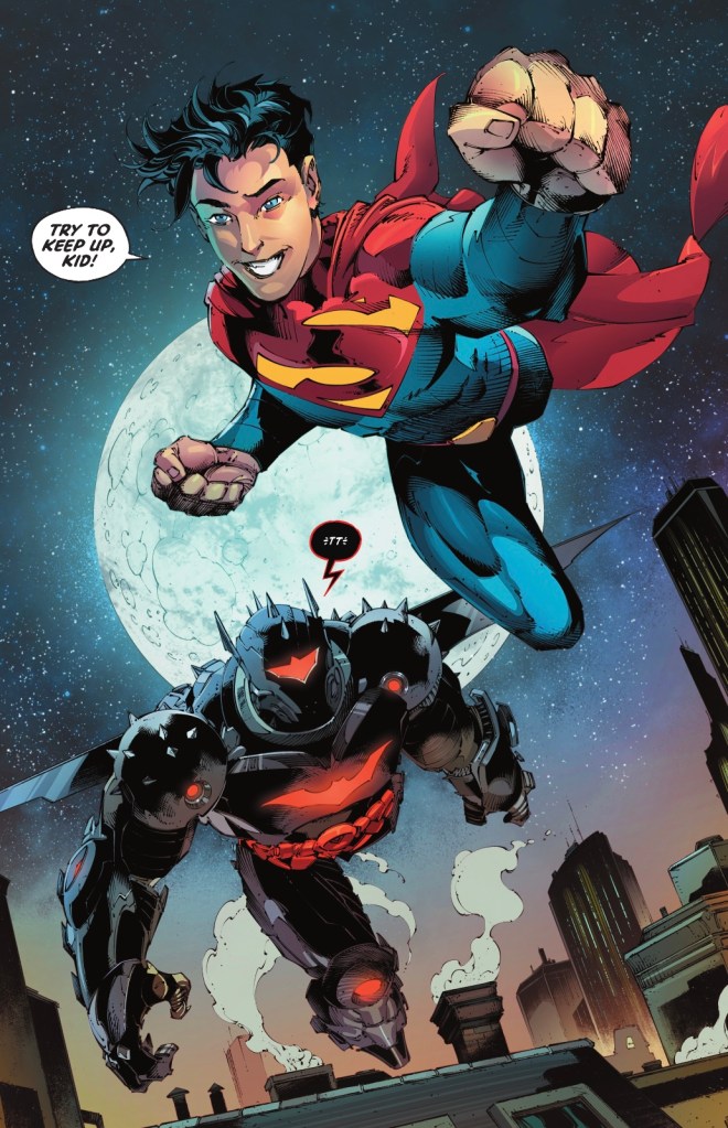
Jon looking very much the young Superman, and Damian keeping up in the old Hellbat suit – such fun!
I couldn’t tell you who inked that page, as the 48-page issue has a bevy of embellishers – Daniel Henriques, Scott Hanna, Matt Santorelli and Bogdanovic himself. The look is pretty consistent, no doubt helped by colourists Ivan Plascencia and Matt Herms. Letterer Tom Napolitano turns in a typically smart job, while Alejandro Sanchez provides the moody colours for Bogdanovic’s crisp cover illo.
I loved this comic, and hope it sells gangbusters, because I want more. Call it Supermam & Robin if you must, DC, though Super Sons is obviously better, but make this a quarterly, at least. Damian and Jon together is guaranteed fun, and I want more. Lots more.

So I kept an eye out, and this story has one of those “patented DC montage” pages I promised I would try to identify. It’s the splash page with the recap of the cube and the dinosaurs, with all the editor’s notes. Now, this is certainly a simple montage to interpret, because the line art is very simple and the “panels” (that is, the separate story elements that are floating in different areas of the montage) are very distinct. Still, the colorist did have to blend the different areas, which flow from purples to blues and greens as you move down the page.
This illustrates the technique, but doesn’t show by any means how complex these can get.
There was another one this week – in Robin #10. A bit more complex. A wide-eyed image of Robin’s great grandmother, blending into a green demon holding a fiery globe, blending into Ra’s hugging his mother, flowing into a second image of the two of them. This time the colorist had to blend pale greens into yellows into darker greens, and a green area in-between the 2 appearances of Ra’s could be background, or could be part of the demon’s body – there’s no boundary to distinguish.
While that one is still not particularly complex, though it’s more sophisticated than the one in this Superman Robin Special.
It’s just a thing DC does. Meanwhile in the history of Marvel Comics, I don’t think I’ve ever seen this kind of montage, so think it’s unique to DC style – but I could be wrong about that.
To be honest I don’t know if montage is the right word for this technique. What would be a better term? Is it more of a collage than a montage?
BTW I can’t figure out where the Fortress is. In JL they are taking it back to the Bermuda Triangle. It seems to be in both places, depending on the story.
LikeLiked by 1 person
I meant to ask – since you read the digital, does guided view work well on these types of pages? Does it zoom in on each section of the page as if it’s a separate panel? And, since I’m sure you’ve seen this type of page very often, do you find it ever gets the order wrong?
LikeLike
I’d say it’s a montage scene rather than a collage, given it’s pieces of new art being set alongside one another rather than previously published images that are refurbished. I’ve not seen the Robin #10 scene, I packed in the series after the first issue, my tolerance for Ra’s al-Ghul stories is pretty much in the negatives. And Marvel never do these pages? Is that because all the exposition goes on the the p2 recap page?
LikeLike
There are some very good artists at Marvel with their own unmistakable styles, and some have worked for DC at various times like Alex Ross or Phil Noto.
But in general there’s a house style at Marvel and it’s kind of simple panels. And there’s a more freeform style at DC. And I remember these differences going back to the mid 1960s. Kirby was more or less art director, and aside from the occasional splash panel for Galactus or something, he was into 6 panel grids. And over at DC, an anarchic panel design prevailed, with limbs popping out of panels, or panels with no borders – the same differences to this day.
These montages tend to happen mid-book, and I’m not sure they have been used as recaps, but this one is a flashback and that seems to be a very good use for the approach.
Maybe the Marvel method doesn’t lend itself to montages. Left to their own storytelling devices, what artist would impose the task on a writer of putting dialog and/or narration on a montage? It would be almost presumptuous. Some writers might have virtually no idea what to even do with the page, and probably no artist would just conjure it up in their own mind as part of the storytelling they are asked to devise. But it’s easy to imagine the reverse, a writer, in a full script, describing the general idea of how the page should look.
LikeLike