
Now here’s a cover that’s hard to resist. After years of Wonder Woman, warrior princess, here’s Diana, Disney princess.
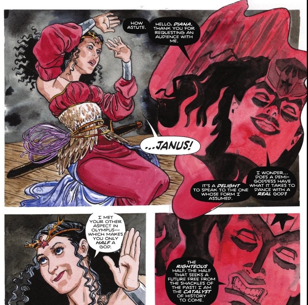
Mind, she’s very much a modern Daughter of Walt, standing up to bullies when she finds herself in Fairyland. It’s the latest stop in a tour of mystical realms that has so far seen Diana have a brilliant time in Valhalla – she’s currently kinda sorta dead – and a less fun stopover in Olympus. The visit to the latter saw her learn of Janus, whose female aspect has split off from the immortal watchman and embarked on a campaign of godslaying. I don’t remember the details but I’m very much enjoying the ride.
This issue couldn’t have an artist more fitting to a story full of faes – Jill Thompson, whose fantasy art has gained quite a following since she was Wonder Woman’s regular illustrator in the early Nineties. She went on to spend time on Sandman and it’s that Vertigo vibe she works here.
Diana and talking squirrel pal Ratatosk find themselves in the realm of Elfhame, only for the Norse messenger to fall foul of local delicacies.

Worse, they’re soon captured after Diana is accused of killing the recently departed Queen. While Ratatosk is spirited away to be locked up with stolen Earth children, Diana is – of course – tucked away in a tower. But she does have someone watching over her. Or maybe under.

The puddle being akin to a magic mirror, Deadman is soon usurped by an evil queen.
Diana is unperturbed, though she is momentarily shocked when a new friend reappears unexpectedly.

Well, I never expected to see Siegfried again, following his adventures with Diana in Valhalla, but here he is, summoned by Ratatosk and looking quite the Prince Charming. But that’s Wonder Woman as written by Michael W Conrad and Becky Cloonan for you – full of surprises. By the end of this issue Diana has defeated her various fairy foes and found herself in a very different – but familiar – fantastic realm.
The characterisation of Diana is terrific. There’s no angst about being dead – hey, she’s been there, done that, back in the John Byrne days – instead, Diana leads with her wit. This is the first time Diana has had a sense of fun since the Gail Simone days, 15 years ago or something. She’s smart, knowing the rules of fairyland before Deadman tells her, and adapts quickly when her latest magic lasso, borrowed from the valkyries, begins chatting to her.

Is Diana worried about forcing her will on people? If memory serves, for years Diana’s lasso has only been used to get people to tell the truth/look into themselves. But we’re in the New Frontier era – it’s even referred to in the dialogue – so she should have a sense that she’s been doing this since the Forties. And even if not, today’s Diana is first and foremost a warrior, used to forcing her will on people with violence – a rope is at least more gentle.
It’s excellent to see Siggy again, he has that Errol Flynn/Fandral the Dashing quality. And I’m finally starting to trust Ratatosk – his reaction to being a human was loads of fun, with Thompson’s bawling bairn just perfect.
Plus, I love that the fairy folk ‘sound’ British, with phrases such as ‘cack-handed’ and ‘arse over tit’. OK, a sprite was cut off before he could finish the phrase, but we know where he was going.
Said titchy fairies really do look great as depicted by Thompson, who’s working in full colour. And the bigger folk look fine too.
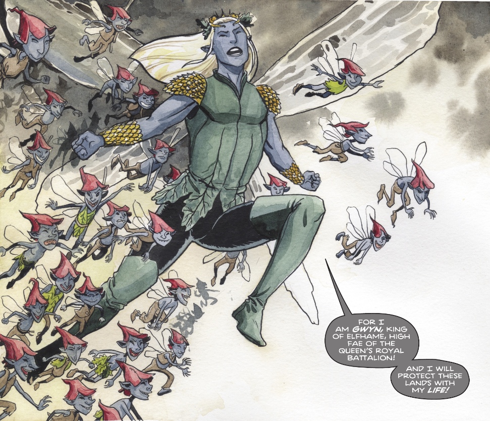
Gwyn really does look to have stepped straight out of Vertigo’s Books of Faerie, I wonder if Morpheus or Tim Hunter are lurking among the trees.
And I love that when we get a peek at Diana’s feet she’s wearing her Bronze Age boots… there you go, a New Frontier nod!
The last couple of pages are drawn by Cloonan herself, with colours by Jordie Bellaire, and they do a fair approximation of Thompson’s style.
As do Travis Moore and Tamra Bonvillain, whose visuals kicked off the current storyline, on the glorious cover. How cute are the evil fairies, and well done to DC’s production department for getting one to perch on the logo.
Letterer Pat Brossseau excels, with lovely combinations of colours and fonts. I’m particularly pleased to see some word balloons have colourful backgrounds – I’ve liked this technique since its use in the earliest days of Marvel Comics, when people would speak in yellow or pink or blue bubbles. Unless there’s a story reason to keep things dour, I’m all for brightening up the pages.
Next issue looks to be another winner, with a different kind of fish out of water tale to those we’ve had of late. And given that while this book is listed as being published monthly, it still seems to be on the recent fortnightly schedule, I won’t have long to wait.
This issue also features another entertaining, nice-looking Adventures of Young Diana chapter, with more secrets coming out and the ultimate one being… one we’ve seen in Wonder Woman many times. Were I to pose the question: ‘Who has been keeping secrets from the Amazons?’, I think you’d get there pretty quickly. Still, since this strip from Jordie Bellaire – here writing – artist Paulina Ganucheau, colourist Kendall Goode and letterer Becca Carey looks to have been created for the younger market, readers of a collected edition won’t have been here. At least not so often.
This is proving to be one of the best Wonder Woman runs in quite a while, I hope you’re enjoying it too.

It’s just been fantastic, though I do not care much for ‘Siggy’.
LikeLiked by 1 person
The character or the diminutive?
LikeLike
Lol! The character. Just find him annoying, but that’s just me.
LikeLike
I didn’t notice Wonder Woman’s boots, and if you’d asked me what they normally look like, I’d have drawn a blank.
So I did a deep dive, er Google search, and came up with:
https :// ew . com /books/wonder-woman-costumes-evolution
Thomspon draws them a little inconsistently – is the stripe white or yellow, and does the stripe also go around the top of the boot? But v-shaped boots with a flat bottom and a stripe down the middle could even be the very original from 1941, or could be the ones from 1987.
The final moment sees her in a blue skirt (and some kind of broad heels on her boots). No stars on the skirt, but has she worn a blue skirt since 1941? No according to this ew article.
I liked this one less than you.But do I like their humor still, especially with Ratatosk. They brought back the sword joke again! I don’t think they think it’s funny – more likely they think it’s funny that they keep using the joke. The brief montage of Diana’s “horrific” exploits with Siggy waged against a giant mouse king and a picnicking raccoon is quite funny
Frankly I don’t know what’s going on with the swapped children. Faerie scout agents are scoping out earth, and the only way they can get there is by taking the place of children? I guess classic fairy tales have to include endangered children.
LikeLike
That final panel did look like she was maybe in a Forties look, and I was excited until I noticed the Hall of Justice. Still, whatever happens, it’ll be fun… and did I read a somewhere that the superb Will Conrad was doing some art soon? That would be a treat.
Bring on the boots!
LikeLike
I hadn’t heard that about Conrad. Travis Moore is drawing Aug, Sep and Oct, and that will be a relief to me. I like his work. But he’s no Conrad. Thompson’s work was interesting but not really my cup of tea, and whoever did the prior couple of issues was making me think of dropping the title. (I’ve considered it really since Steve Orlando moved on.) I’ve hung on because Moore is coming back.
(Maybe you read something that confused Will Conrad with Michael W. Conrad, co-writer?)
Conrad’s work on Justice League Odyssey was amazing. He knows how to do splash pages well, and many of this pages were full spashes, with inset panels. A style I saw much more of in general a year ago but rarely see now. I love it. John Timms just employed the same style on a lot of pages in Son of Kal-El. It’s as if the full splash was at least sketched, the inset panels then placed on top, and only the visible parts of the splash probably got finished. All the important content is in the part of the splash that isn’t obscured, while the rest forms part of the background of the splash panel. It fosters a sweeping view of things.
Even Cliff Richards, who did some fill-in art for that period of JLO, stepped up his game, I thought.
I eventually loved Dan Abnett’s story too, so I really miss JLO. A book that started weak but ended up among my favorites.
LikeLike
I bet you’re right about ‘Will Conrad’ being a mistake… I think read it on Bleeding Cool, so there you go. Did you ever see the artist Conrad on the Captain Atom mini of a few years’ back? I reviewed a few issues here, it was amazing.
I’ve just gone back to Jon’s first issue but don’t see any examples of this splash page technique. I must be dimmer than I thought!
I’d let Dan Abnett write anything he wished to at DC. Is he back at Marvel?
LikeLike
I spot 3 such splash pages in addition to the regular kind of splashes:
1. Where Diana says “Contractions are five minutes apart.” There’s a page-sized fortress, though the only significant element is the partial close-up of a med droid. (And by the way, the reference in your comments on Anj’s Action review – “Line of the issue, though, goes to Jon – ‘Also, you killed our medical droid'” – reminded me of the amusing sight in this panel of a droid carrying around a tablet clipboard! I actually laughed out loud when I saw this, and rarely do when reading things.)
2. “But they decided I was a risk worth taking” with the couple holding baby Jon. The extra splash area just shows more of the bedsheet.
3. “Hi. I’m Jon.” This one is probably an example of it though it’s less obvious because there’s so much fire everywhere. I’m pretty sure the tall left-most panel extends throughout the page.
What’s interesting to me about the 4 overlays in this last example is: the top one is standalone; the 2nd one extends down to cover the top of the 3rd one, BUT Jon’s head from the 3rd one pops over the bottom of the 2nd one; Jon’s right elbow and forearm extend past the gutter below the 3rd one; and the 4th one extends above the bottom edge of the 3rd one while also covering Jon’s jutting right arm and hand.
That juxtaposition of the 2nd and 3rd panels creates an interesting effect – it’s as if the 2nd panel slips in between Jon’s head and the background of the panel he’s in. Physically it’s entirely possible to stand in front of a backdrop, and then hang a higher backdrop above and let it fall in-between your head and the lower backdrop. But sometimes, artists do a whole bunch of such panels nearby, so that some adjacent panels are in front of, and some behind of, each other. In some cases it’s near-Escher in impossibility.
Timms employs elements of these techniques throughout the book. Most often, and very commonly done by countless artists, heads popping across the gutter into the panel above.
Sometimes I take time to look at those artistic decisions in detail. Some artists do it a lot; some, like Alex Maleev or Nick Derington, don’t do it at all. It was DC house style for most of their artists, with exceptions like those guys. Marvel almost NEVER does this kind of art, and it seems to me rarely even does a traditional splash panel let alone a double-page splash. I find Marvel art to be less dynamic.
It’s a pretty meaningless element of the art – the DC art director, who was Mark Chiarello until he was fired in last year’s purges, could easily request this kind of thing from artists – just show them a sample or, probably, just tell the artists to “DC it,” and the same artists could draw like this, or draw regular old boxes, without blinking an eye. It doesn’t look hard vs. the REAL work of composition, anatomy, story-telling. Free-lance artists do work for all the publishers and adapt readily. Chiarello was at Marvel earlier in his career, but I don’t associate this with the Marvel house style, so I don’t know what changed. Maybe he adapted to DC.
When I think of the 1960s, Marvel was all about very, very rigid panel grids. I think Kirby was the art director, and think of a standard Kirby or Ditko page, with their regular panel spacing. In the 1940s and 1950s, Kirby used to add circular panels on most pages, but stopped that entirely for the Marvel Age. At the same time Marvel was drawing boxes, in the 1960s at DC you had bodies bursting past panel boundaries. (There were differences in lettering and coloring, too – Marvel production quality was poor at the time and I think they made some limiting design decisions because of it.)
Alvaro Eduardo Martinez Bueno (or some combination of those 4 names 🙂 ) did a lot of this kind of elaborate panel design on Justice League Dark, but is using almost entirely conventional panelling in his current horror comic with Tynion “Nice House on the Lake.” I could spend a long time just contemplating each of his JLD pages. No JLD artist since has come close to his very exciting work on the book.
I like the style, for some reason. Gives me something interesting to notice.
In fact after finishing a comic, I always do an immediate second pass just to look for these kinds of things, which I won’t pay attention to when reading the story. (Well, it could be the 3rd pass, if the writer used the dreaded “dual story” narration technique I hate so much. Stephanie Phillips just employed it with Harley Quinn this past week, which means first I read through till the narration ended, then the 2nd pass was to read the actual story while ignoring the narration indulgence. The 3rd pass was the Rossmo pass, not my favorite to think about.)
DC artists are doing this style of art less often now and I wonder who the current art director is. You still see tons of regular splash and double-splash pages, and irregularly shaped panels, and panels with montages (which I find confusing to read, and can’t even understand how the colorists know how to blend one area of the montage into another), but less of this “overlay” stuff.
People don’t discuss this kind of thing much, but they remember actual story events much, much better than I do.
Once again I got inspired to ramble!
LikeLike
P.S. I can’t draw AT ALL, and I can talk about panel and page design more intelligently than the actual artwork. So I don’t want to create any false impressions about my art appreciation or skills!
LikeLike
I really liked this issue, too. My favorite thing was that it was done in one. Part of a long ongoing story, yes, but the whole Faerie adventure had a lot going on and yet they told it in a single issue. Could stand more of that in my comics.
I loved Jill Thompson’s run back in the Perez era, because she drew Diana looking like a teenage Greek girl rather than a generic brunette supermodel (which, to be fair, was/is the default), and it just elevated the humanity back when Diana’s newness in Man’s World was foregrounded. But Jill was definitely still developing, and her art has gotten so much richer over the years.
I’m out of the loop: Has some cosmic reset established (per the semi-abandoned “5G,” I guess?) that Diana has been on the job since the forties? Snuck that one in with nary a ripple, I guess. Does this mean Steve Trevor is an old dude again?
This IS a great run of WW, hearkening back to Simone. I’ve found in recent years (post New 52) that I find myself leaving the title when a new writer comes on, then coming back on when that one leaves, and repeating with the next shift. I’m hoping this team is in for a long haul, and that they’ll have time to show us Diana’s current status quo, with ongoing relationships rather than new strangers-turned-friends. That was something I liked in the Perez and first Rucka eras, the sense that she had a life and a community, not just a mission.
LikeLiked by 1 person
You raise a good question about how long WW has been engaged.
In the giant-sized Wonder Woman #750, Scott Snyder wrote the story “A Brave New World” set in 1939, where Wonder Woman, initially wearing a red hood and cape atop her regular outfit, saves FDR from a missile attack, and inspires Alan Scott (who already has his ring, but I guess hasn’t been doing much with it) when he sees the event in a newsreel. Wonder Woman is then established as the first super-hero to appear, with the implication that she inspires all that follow. But was that intended to be the debut of a new canon? Was it the first hint of Infinite Frontier? And is it still canon? How much has Death Metal reset? WW 750 came out half a year before Death Metal, I think, though all the Justice League Perpetua stuff had been well underway for a while.
LikeLike
Ah, yes, I remember that short story from a couple of years ago, thanks for the reminder. It’s hard to keep track of what “continuity” is anymore. Which is a shame. I don’t need it to be a straitjacket, but I wouldn’t mind a firmer foundation.
LikeLike
Oh, I’ve been the same, trying books again when a new writer arrives, becoming quickly disappointed and leaving for awhile. This pattern is certainly true for WW, which is why I do the occasional Bronze Age review, I get sentimental.
I liked that WW in the Golden Age story, but I think it instantly became apocryphal. I THINK the current situation is that ghe GA WW was a separate character on a separate Earth but the latest crisis has merged people’s memories. Or… something. Lordy, superhero comics shouldn’t be so complicated !
LikeLike
Jill Thompson’s The True Amazon (2016) is the best Wonder Woman Year One story by a wide margin, while her work on the monthly title was distinctive. Generally, women artists don’t draw Wonder Woman for long stretches, while Gail Simone’s run might be the longest of any female writer. Even working with another writer, Thompson has carved-out her own version of Wonder Woman over the years and I am always delighted with her creativity. Too bad we cannot get the massively talented Thompson back on the Wonder Woman book on a regular basis 😀
LikeLiked by 1 person
Brad, you remind me I’ve never actually read that one. DC seem to let someone redo Diana’s origin annually, but a Jill Thompson version has to be worth a look! I shall seek it out when that darn DC Infinite app finally reached across the Atlantic.
LikeLike