One night in Gotham and Harvey Bullock activates his Bat Signal. It’s defiantly lo-fi, but effective.
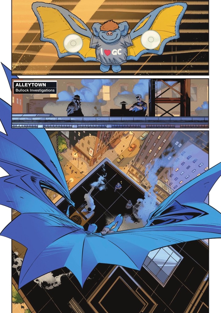
One-time GCPD detective Bullock and Police Commissioner turned beat cop Jim Gordon have been given a message to pass on – ‘It’s him. He wants to talk…’
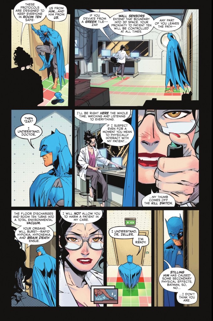
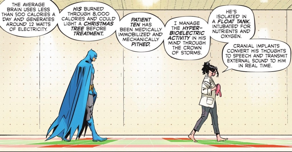
Of course, they mean the Joker, who, it turns out, is in a Waynetech facility, under the care of the scientist who’s lately caught Bruce Wayne’s eye, Annika Zeller. She’s not thrilled to see Batman, but if her patient wants to see Batman, Batman will be seen. And so, Caped Crusader becomes Bootless Batman.
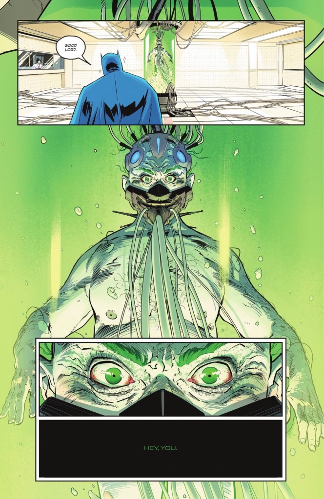
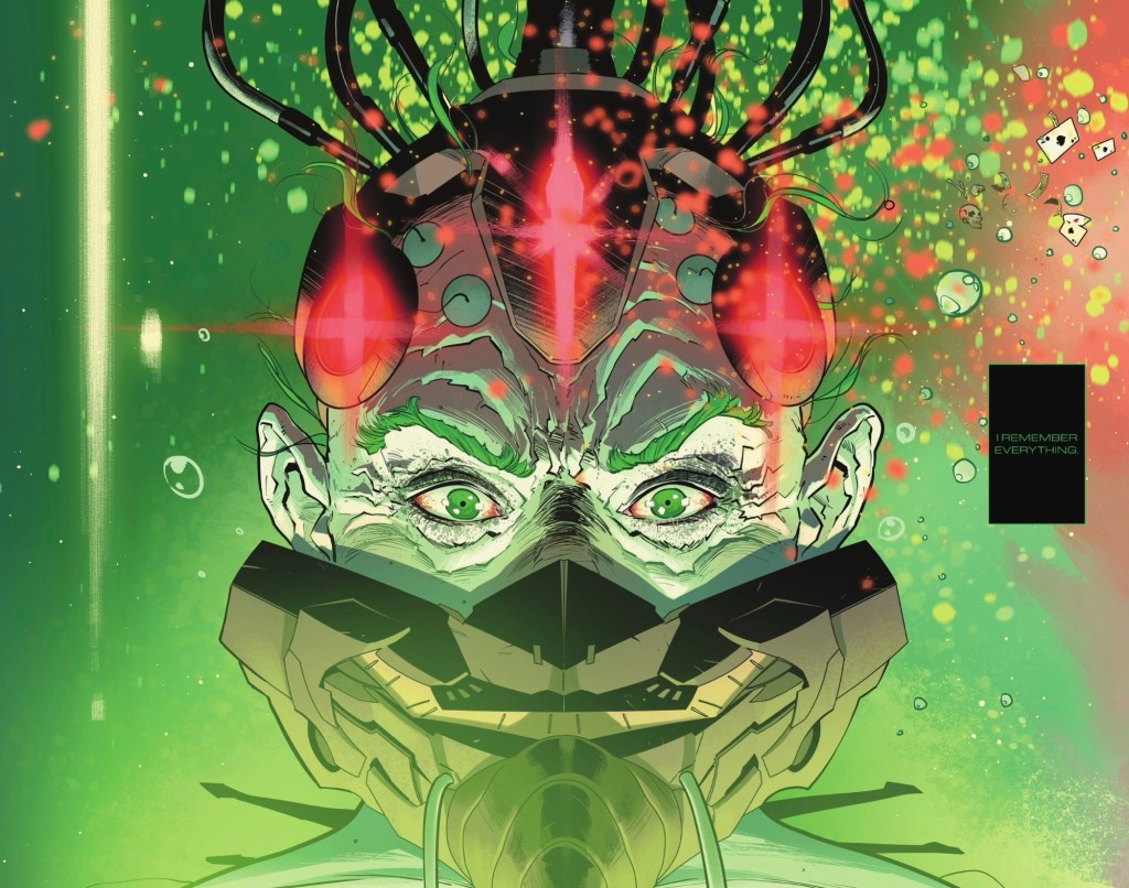
The Clown Price of Crime has had something of a makeover.
So what’s up?
There follows the Joker speaking as if the treatment has given him an epiphany…
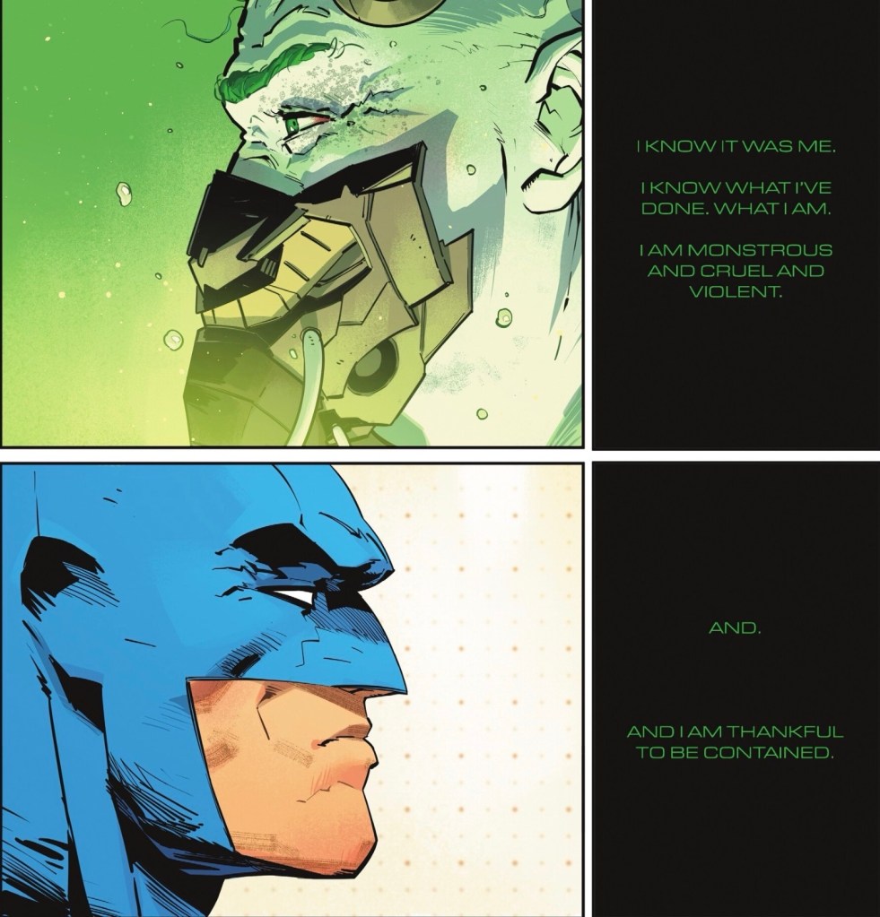
… and Batman is understandably doubtful.
This issue, I bought twice. Once in the usual digital form, because it makes for great screen shots, and once as a physical comic because it features ‘a stunning foldout sequence’. Every time DC does a gimmick – such as the DC All In Special #1 flipbook or Absolute Martian Manhunter #1 with added ‘Martianvision’ – it’s something that doesn’t work in the digital format. This time I decided to spend a few quid and perhaps be stunned.
I’d have to be blind to be unimpressed by Jorge Jiménez’s artistry. Halfway through the book the Joker throws Batman’s assumption he’s going to say he’s not the monster he was, that he’s going to claim he remembers nothing, back in his face: ‘I remember it all.’
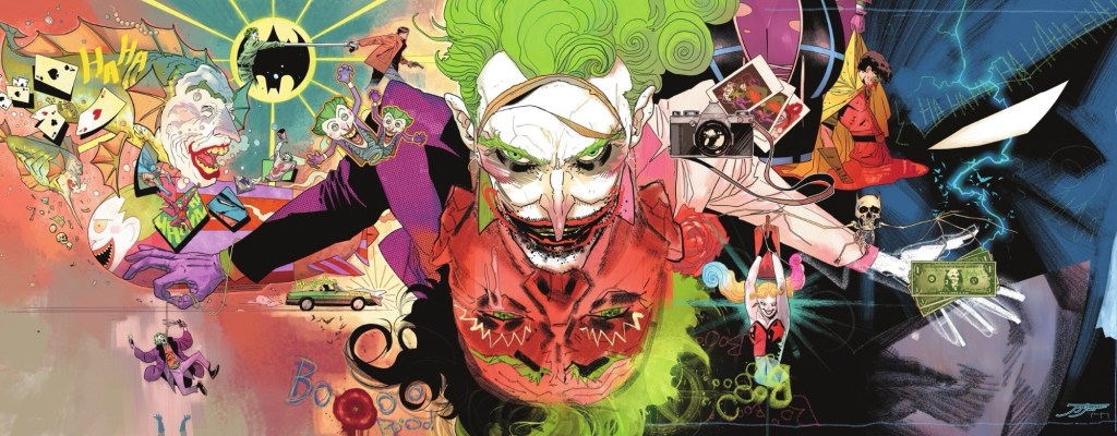
Imagine that as a foldout, four regular comic book pages long. The central image of the classic Joker, images from his horrific career as Gotham’s bogeyman going right back to the Golden Age. A massive, looming Batman. A killer Jokerfish. A murdered Jason Todd is grislier than necessary, but the rest is rather great, with the agonised upside down pre-Joker (?) especially impressive. I’m surprised we get neither a Killing Joke reference nor a nod to the death of Gordon’s wife, Sarah Essen, but maybe the deaths of civilians just aren’t that memorable to him.
It’s the always excellent Jiménez unleashed, his usual clean stylings embellished with a side of Bill Sienkiewicz or Dave McKean.
And on the outside of the foldout, the window to the Joker’s soul, a close up of the new guy, the familiar grin hidden by a well-contoured breathing mask.
And so far as I can tell, DC not only hasn’t charged any extra for this issue, they’re giving us extra – it comes in at 30 pages for $4.99. Now that’s stunning.
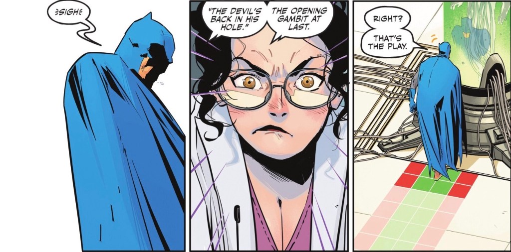
Jiménez’s art is, as ever, slicker than slick, but not soulless. Batman looks formidable, even without those boots, while the new Joker is somehow freakier than when he was wearing his own cut-off face. Dr Zeller spends the whole issue being frustrated and grumpy, but not unattractive. It’s a very talky instalment – no fighting – but Jiménez holds our attention.
He’s partnered with the excellent Tomeu Morey, whose bright colours are a delight after decades of dark’n’moody. Every page is filled with thoughtfully placed tones.
As for Matt Fraction’s script, I am intrigued. Batman knows Joker isn’t on a redemption arc, Joker isn’t fooling him – whether or not he’s trying – but the big question is, what does Zeller want? She can’t be naive enough to be fulfilling the cliche of counsellor falling for criminal – Harley Quinn got there first. What’s her endgame?
The end of this issue is pretty similar to the end of Batman #5, but I shan’t say any more, just that it represents the Joker trying to be helpful. Apparently.
The lettering is at times tedious, with all the Joker’s dialogue in a dulled-down style, a very straightforward, almost robotic, font that’s green out of black, and pretty tough to read in the print version. Here’s a side-by-side, with print first.
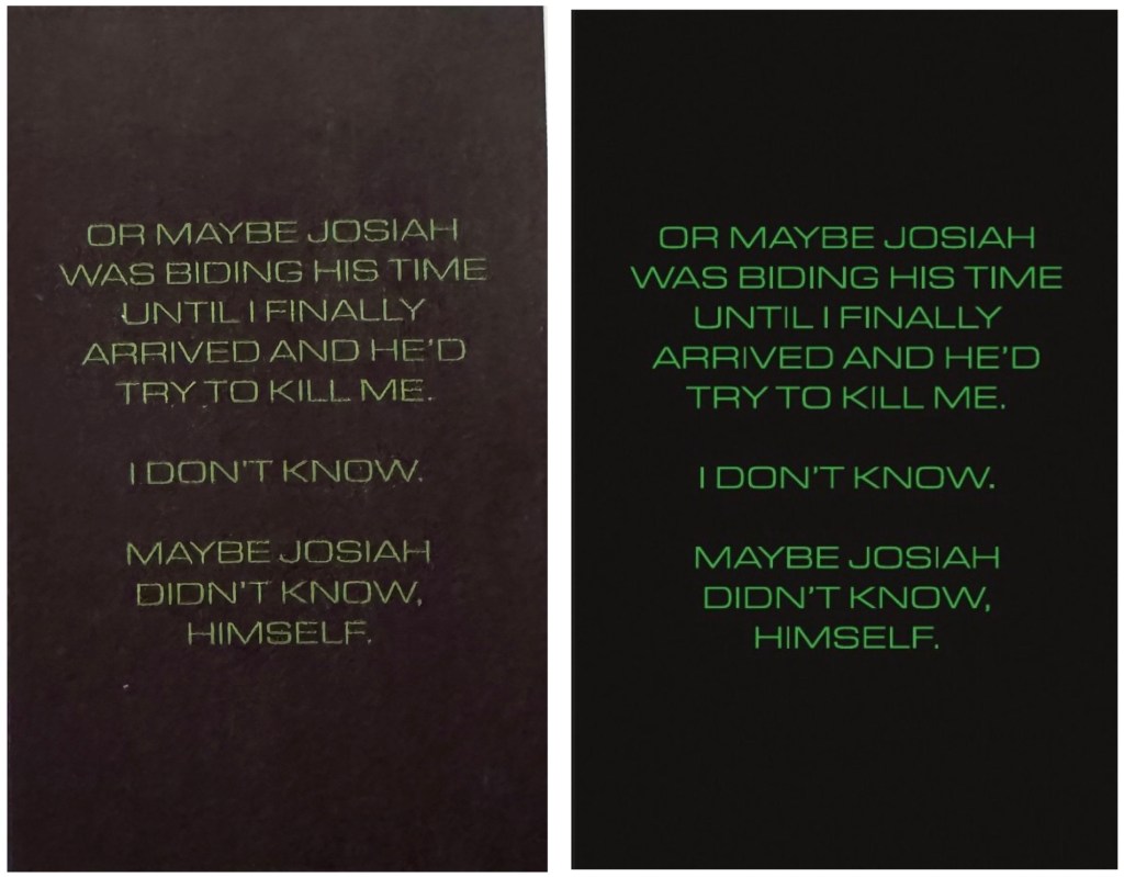
It’s actually a lot easier to read in the photo version than the print ‘image’ I snapped. Perhaps I got a book from the end of the print run, but surely quality control is better now than in decades past?
Clayton Cowles’ lettering for the regular dialogue is much more attractive and readable.
The cover by Jiménez, working in full colour, is fine, reminds me of those Marvel covers featuring Wolverine claws scratching through to page 2. On the one hand it makes sense to get both hero and villain in the shot; on the other, it implies Batman and Joker are two sides of one coin, a notion I’ve never subscribed to.
Would I recommend a regular digital buyer picks this up in paper form too? I would, actually – as gimmicks go, this one works narratively in print in a way it just doesn’t on screen. All told, it’s rather neat.

Great review as always and that it’s your review is the only reason I clicked on this. I haven’t enjoyed Batman in decades, many other characters deserve a writer’s creativity more than the overused Joker, and Defenders among other tripe from Marvel has turned me off on Fraction permanently. You got me reading a Hal Jordan book and jumping on and off a Wally West book but nope, not gonna do it this time.
One Thought based on what you wrote: Wouldn’t it be original and shock everyone if that Zeller person were earnest? Maybe knowing she’ll fail with the most overused villain at DC but hopes to save others with techniques she’ll perfect on the Joker? Not that I expect that from Fraction. He’s the writer who claimed Betsy Braddock, a rich white woman wearing an Asian woman’s body was an example of diversity in X-Men.
LikeLiked by 1 person
I don’t know Steve, miracles happen; maybe Matt Fraction is sharp enough to realise we’re all expecting Zeller to be dodgy, and he will zag rather than zig.
I’ve not consistently enjoyed the Batman line since No Man’s Land hit, but the sheer number of Batman books means there’s usually something for me to enjoy.
LikeLike
I thought the camera in the fold-out was a reference to the Killing Joke.
I only buy print, and Joker’s dialog was brutal to read. My copy is no better than yours. DC seems to often color pages with insufficient consideration given to how they will look when printed, and this especially applies to lettering when the text and/or backgrounds involve anything other than black text on white. If you bought more in print you’d probably see what I mean. It can drive me crazy. But not ready to give up on paper — yet.
I’m enjoying this story, and curious how things with Dr. Zeller will turn out. Love the teamup of Jiminez with Morey, as always.
T.N.
LikeLiked by 1 person
Remember the red on black captions in Batwoman?
LikeLike
Thanks for the extra info on the state of print, TN. I still buy collections but don’t miss the piles and piles of comics I’m never going to read again. I must say, though, it was nice to be back at the comic shop… I used to work five minutes away, but working from home means it’s a hike!
Oh for goodness’ sake, how did I miss that massive great camera. Thank you for being awake!
LikeLike
I probably wasn’t reading Batwoman the last time she had a series, but I remember that font for the dialog of Batman Who Laughs! Awful. I was so happy when BWL ascended to Godhood as Death Metal progressed, because they switched his fonts to white on black. Nobody liked that red on black.
The soon-to-arrive new Batwoman series is going to have pretty controversial art (by the artist Dani – love it or leave it, it’s very distinctive). We’ll see how that goes.
T.N.
LikeLiked by 1 person
Oh, if only I could forget that font! Remember the even worse Flash Who Laughs (or whatever) treatment, which was pretty much the same as The Batman Who Bores, but with the words doubled up?
I didn’t realise Dani’s art was controversial – I rather like it, when coloured at least.
LikeLike