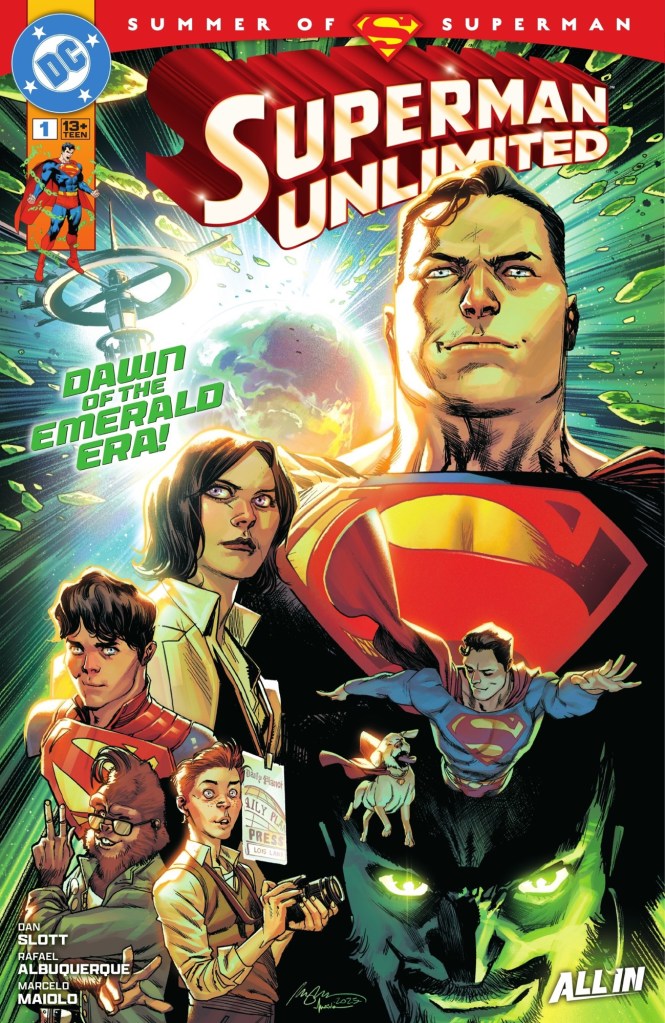
Change is in the air at the Daily Planet. There’s a new owner, and she has big plans.

Clark Kent can’t stay to hear the full extent of Imani Edge’s plans, there are citizens of Metropolis to be saved…

… hang on, there’s everyone in the world to be saved!
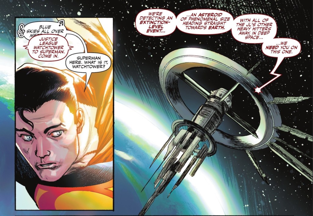
Trouble is, maybe Superman can’t protect them.
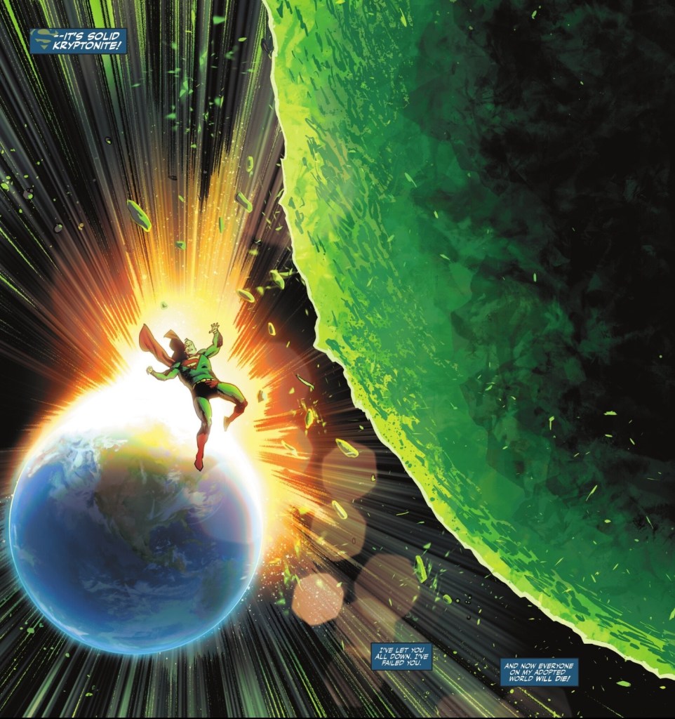
Dan Slott, in his first DC series for decades, throws Superman a curveball – a massive, green, glowing curveball. Superman manages to divert the Kryptonite asteroid enough to stop it extinguishing all life on Earth, but when it makes landfall he’s underneath it.
Three months later, Superman wakes up on the JLA Watchtower to learn the world has changed.

And so has he.

We’ve had Superman Red and Superman Blue, now it’s Superman Gold, echoing one of the recurring motifs of Superman’s memory rush in the moment he thinks he’s going to be killed.
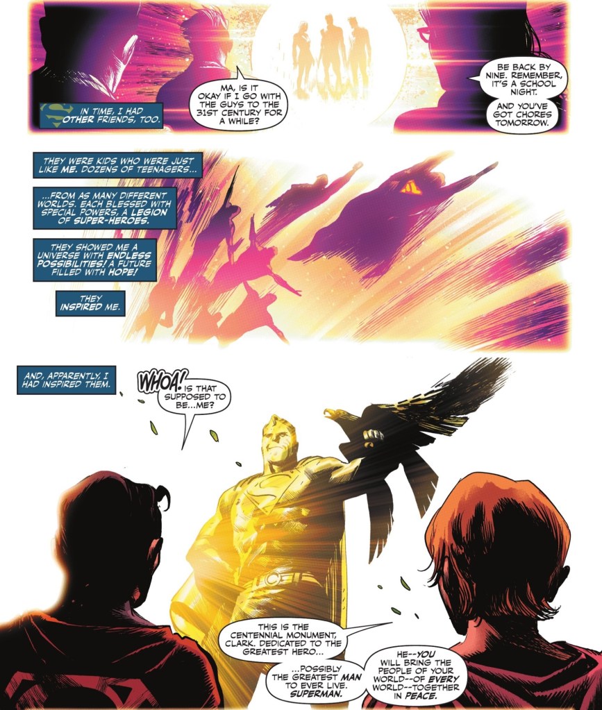
The extended sequence takes us from Kal-El’s first memory – the exploding planet Krypton – to his death, return, marriage and fatherhood. For this debut issue Slott has come up with an organic, efficient and stylish way to say where Superman came from, geographically and emotionally.
But that’s Dan Slott, he knows how to structure a story – just look at that first caption again.

The Daily Planet expands, and so does the Earth.
And the writer has a great handle on Clark and friends, as we see in that opening scene with Ron Troupe and co questioning Edge about her plans. We see just how well he knows Superman via his plea to son Jon in what he fears are his last moments.
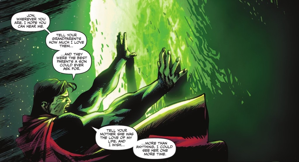
The memories give us something new – Clark struggling with the weight of his destiny as revealed by the Legion of Super-Heroes (blurred in the artwork, perhaps to preserve the make-up of the coming revamped LSH team). And the arrival of Krypto on the scene carries quite the emotional punch.
Understating the indestructibility of Inertron apart, Slott does everything right and I’m looking forward to seeing where he takes developments in this issue. I do hope, though, that the ‘world of green Kryptonite’ storyline is contained within this book, and doesn’t go on more than a year. It’s a big idea, not so much Kryptonite Nevermore as Kryptonite Evermore, but I’d hate for it to outstay its welcome.
Rafael Albuquerque is a big name, and a very good storyteller, but I’m not convinced he’s right for Superman. Our hero is not so much off-model as downright freaky looking at times. Editors Jillian Grant and Paul Kaminski could reasonably have sent some of the images back to the drawing board.

Did the Scarecrow escape from Oz and borrow a super-suit? It’s a shame, pretty much everyone else in the issue looks fine, the flashback is mostly terrific and the asteroid sequence is as effective as it is powerful – but Superman hasn’t yet clicked for the artist. Hopefully that’ll happen soon.
The colours of Marcelo Maiolo sing throughout, one thing I love is how he creates Superman flying at speed with just colour.

As likely as not, that’s based on a note from Albuquerque, so credit to both creators as necessary.
Dave Sharpe’s letters are, as always, exemplary, whether he’s giving us straightforward dialogue or conveying a song.
The montage cover by Albuquerque and Maiolo is effective, but who’s that brown Grinch in the corner? Green Lantern G’nort?
This double-sized opener has me very excited about Superman Unlimited – how about you?
Yup!!!! My exposure to Slott is his very good “Mighty Avengers” book from many years back and I tried his “Silver Surfer” and found it fun/clever but not enough to stick with. I like when someone from one of the Big 2 crosses over to the competition with a fresh perspective. Clearly not everyone did but I generally really liked Bendis’ run on the Super books and “Justice League.” I also am happy that “Superman Unlimited” is meant to be the new-reader friendly title off doing its own thing. So hopefully no mentions of Darkseid, Amanda Waller, power swaps/losses or Absolute DC. Leave Slott alone and based on this first issue I’ll be very happy! – Brian
LikeLike
I loved Bendis’ run too on both those books. Tomasi’s boring untold Super Sons maxi made me never want to see younger Jon ever again as well!
LikeLiked by 1 person
Aw, but he was so great I’m Rebirth Superman.
LikeLike
I do not trust Dan Slott with Superman until the first storyline is complete. Great review!
LikeLiked by 1 person
Thanks Tane, fingers crossed the story will prove a winner.
LikeLike
I’m not sure that that was much of a cliffhanger.
So… Superman is gold ? If a flashlight shines on him? Or something? And gold is… what? A bad thing? A cool development? Is this a big deal?
Like… there wasn’t enough information there for me to be invested enough to come back just because Clark is gold (maybe? sometimes?)
The rest of the story was good enough, although it didn’t do much more than establish Superman’s status quo and Slott’s particular point of view.
Albuquerque‘s art was super cool, but I’d agree that his depiction of the title character was wonky at times.
LikeLike
Given the book is called Superman Unlimited and we’re told he’s lost his weakness for green K, I’m guessing the gold is protecting him.
LikeLike
I mean… yeah, of course. It just seemed a little… 🤷♂️? Like if he’s gold, have him be gold! What’s the point of being “gold” if we only see it under certain light?
LikeLiked by 1 person
We shall hopefully see!
LikeLike
Yeah, that panel you highlighted of Albuquerque stood out to me as a ‘yeesh’ when I was reading too. Is Albuquerque a good monthly guy? I think he was artist for the Jamie Blue Beetle right? Wonky was the byword there but it fit a tech shapeshifter. Hopefully he’ll need a lot of fill ins!
The only thing I didn’t like in the book was the ‘day in the life of Superman’. Those bits are cutesy but portraying it as an average day tells you Clark has no life as Clark if you’re gonna buy that he does nothing but save other people when awake.
And god, I hope it’s not G’nort but Slott if anyone could make him tolerable based on his She-Hulk tenure. Who was the guy in the villain montage above Zod? Adn based on the costume was that Shayera Hol, Hawkwoman, in the hero montage? Cool. I’ve disliked or been uninterested in Kendra since her first panel,
LikeLiked by 1 person
I think that’s Shayera of Thanagar, as seen in recent issues of the Green Lantern Corp, she has a purple tinge to her ginger hair. Which is weird. And yes, Kendra is annoying.
Is the mystery villain Blanque from the early Dan Jurgens rebirth stories, the mean telepath?
LikeLike
I won’t go into spoilers from what I’ve read on who the furry character is, but I will say not G’Nort. Not canine. Something more earthbound. But if that’s how they’re being drawn, that’s not great as their species should be pretty much easily recognisable.
I like Slott some of the time but wasn’t sure what level he was going to pitch at, so haven’t picked this up yet. He can be almost too reverential with characters and sometimes end up a bit lightweight and heavy on gimmicks, but he can also be heartfelt and inventive, but also both at the same time. Albuquerque not being up to scratch is a shame. I’ve seen him do good work in the past and you’d think the thing that he would have had to do to get the gig was show he could draw a good Superman!
I did read a review where someone said it felt like this was in competition with Williamson and that the continuity didn’t seem to synch up, any truth to that?
Stu
LikeLiked by 1 person
I heard a Slott talking on Word Balloon this week, and yes, N’ot G’nort is a terrible design.
He also mentioned that the two present day Superman books would indeed synch up, I suppose they are not synching up at the moment because by the end, this book is three months ahead of the other one
LikeLike
Having now read it and had time to digest, I thought it was a decent start. It’s useful to get a primer on what exactly is Supes’ history in All In, and the new set up is interesting, but it would be nice to have got a bit further on in the story. Thanks for the info on the three month gap, that’s very useful!
Stu
LikeLiked by 1 person
You’re very welcome, and yeah, hopefully Slott and co will come in with all guns blazing next time.
LikeLike
I enjoyed the story here, but I found the art bad. I could see the intent, and it was good intent, but the execution was just bad. I’m one of those people who is very much affected by the art in a comic. I have a hard time ignoring it, and if this is the way DC is going with art, and it does seem to be a pattern, I may be giving up a lot of books.
LikeLiked by 2 people
Writing trumps art usually for me but yeah, I’m not sure I like Slott’s Superman enough to stare at the artist’s new style for long.
LikeLiked by 1 person
Don’t misunderstand, if there is compelling enough writing I may be able to ignore the art, but it makes it a lot less memorable to me. If Monstress looked like this, I would not be reading it. DC has really chosen to just cheap out and hire some… I think I’ll stop there because my opinion would be hurtful to artists who are just doing their jobs as best they can, but it is a trend at DC where even titles they are hoping to become tentpoles for their line are just not great. I suspect it is hiring people for less, but I don’t know that to be the actual case.
LikeLiked by 1 person
It could be, they did that in the Seventies with Filipino artists – luckily they were generally superb.
LikeLike
Really? I think I only liked one of them and as an inker on a specific artist. The one that inked Buscema on Conan.
LikeLike
Good luck to us all.
LikeLike
It’s weird to me how few reviewers of this comic have mentioned the wonkiness of the art. Of course taste is a big factor but surely people can see when an artist is inconsistent within a story?
LikeLike