Behind another irresistible cover by Steve Lieber – its Charles M Schulz meets Jimmy’s Silver Age – we get more quirky, compelling vignettes centred on Superman’s Pal and his Pals.
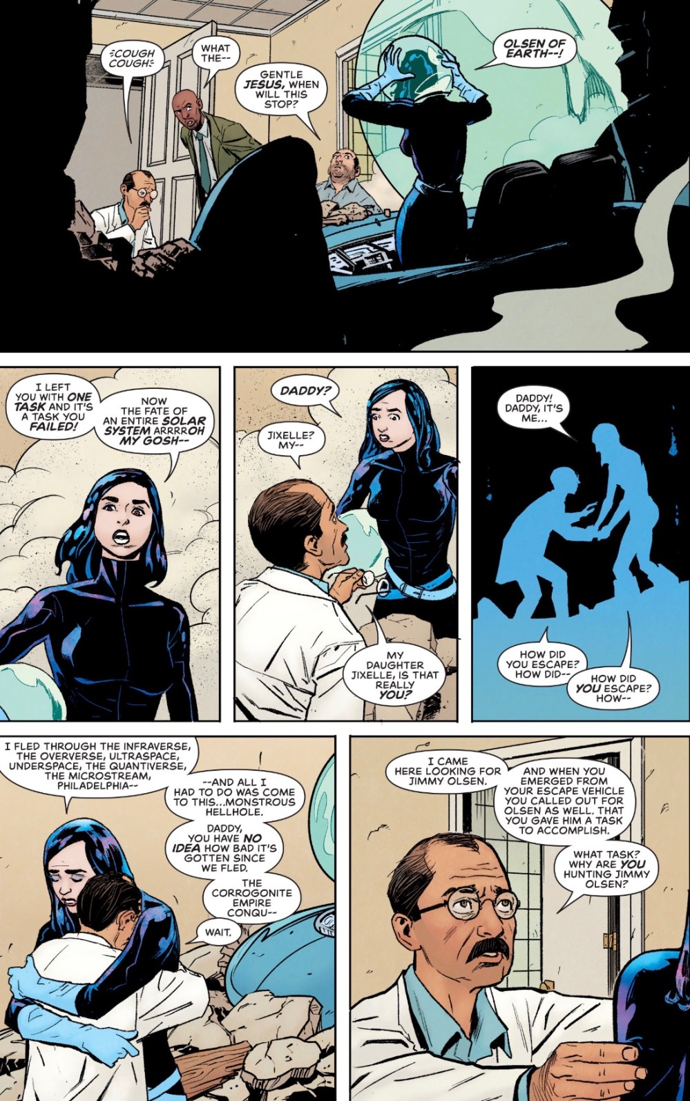
There’s Jimmy Olsen’s Shrink, Dr Lorelei Liu, who wants to find the ‘real’ Jimmy (that’s her in the last two panels).

Jimmy Olsen’s brother and sister, the L’il Olsens, dreaming about their future lives.

Jimmy Olsen’s Detective Pal, Jim Corrigan (no, not that one) meets Jimmy Olsen’s Boffin Pal Dr Anton Martel and Jimmy Olsen’s Accidental Wife Jixelle.
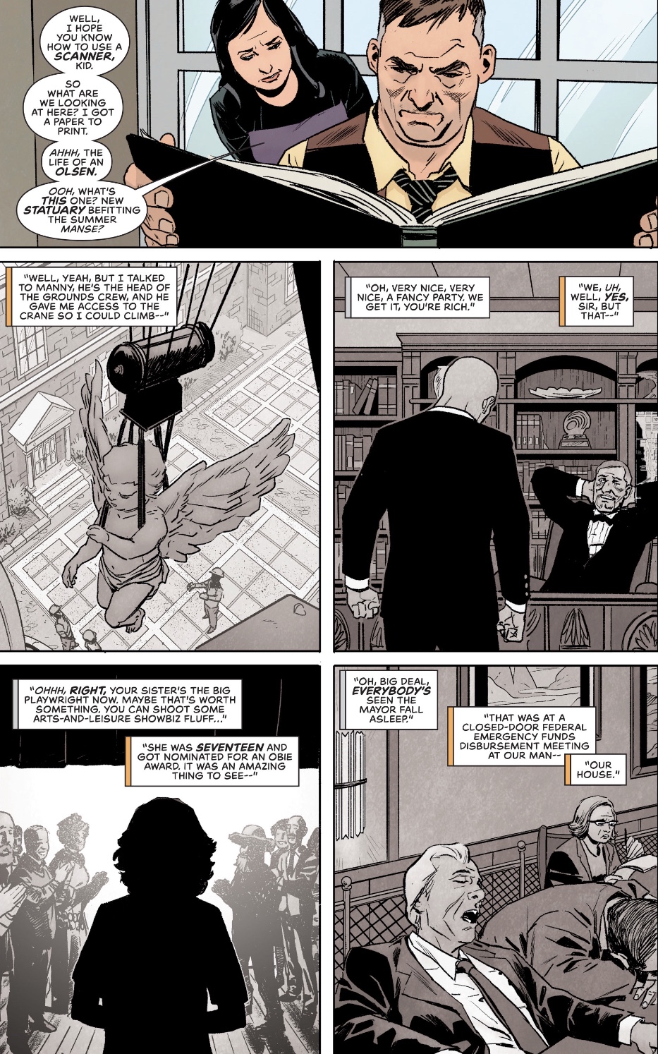
A flashback shows us how Jimmy got his job at the Daily Planet.
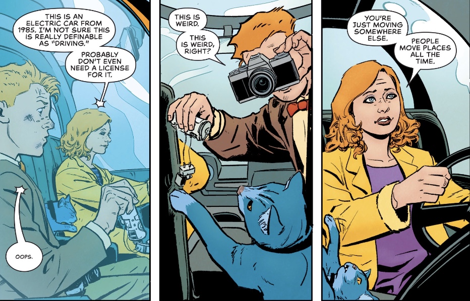
And in the present, Jimmy is on a road trip with sis Janey, aiming to avoid whoever’s been trying to kill him.

After seven issues, I’m well used to the rhythm of Matt Fraction’s structure, but not in the least bored. The chopping and changing allows the writer to get playful but the overarching storyline involving the Olsens generations-long feud with the Luthor family remains the backbone of the book.
Seeing how Jimmy impressed first Lois, then Perry, is a reminder that while he does wacky very well, he has a first-rate journalist’s mind. And I love titchy Jimmy, a proper Calvin without a Hobbes but with a mad enthusiasm for, well, everything. As for the Five Jimmys (who needs the Three Jokers?), it’s a nice wrinkle, acknowledging the various approaches taken to the cub reporter down the generations.
Fraction also deserves praise for giving us not just Janey, but Julian Olsen, sketching them into Jimmy’s life quickly but convincingly. I hope they stick to the Superman mythology.
Steve Lieber’s naturalistic, expressive artwork serves the story brilliantly well, being easy on the eye, inviting, with truth in every line. The panel in which Perry and Lois realise Jimmy is a winner is glorious, and details such as Jimmy’s changing hair add to the experience of the tale.
As someone owned by a pair of cats I definitely commend the work put into giving the pussy personality. And it’s clever of letterer Clayton Cowles to give the word balloons a starred end when we’re listening to dialogue through the car windscreen.
Cowles’ work is also impressive in the intro panels to each short, with lots of expressive font choices and, I think, freehand work. And the font used to introduce Art Deco location Opal City is perfect.
The colours come courtesy of Nathan Fairbairn, and they’re subtle without being dull. As an old school type, I got a kick from the simple, flat tones used for the Li’l Olsens (maybe another nod to Schulz, Li’l Folks being the panel gag that preceded his creation of Peanuts).
Jimmy Olsen, while it has its serious moments – I’m not quite over the way our hero set a clone of himself up to be shot dead – is a breath of fresh air in the otherwise monotone DC line, a real gem.
