 Naomi lives in a small town in North America. One day Superman ‘passes through’.
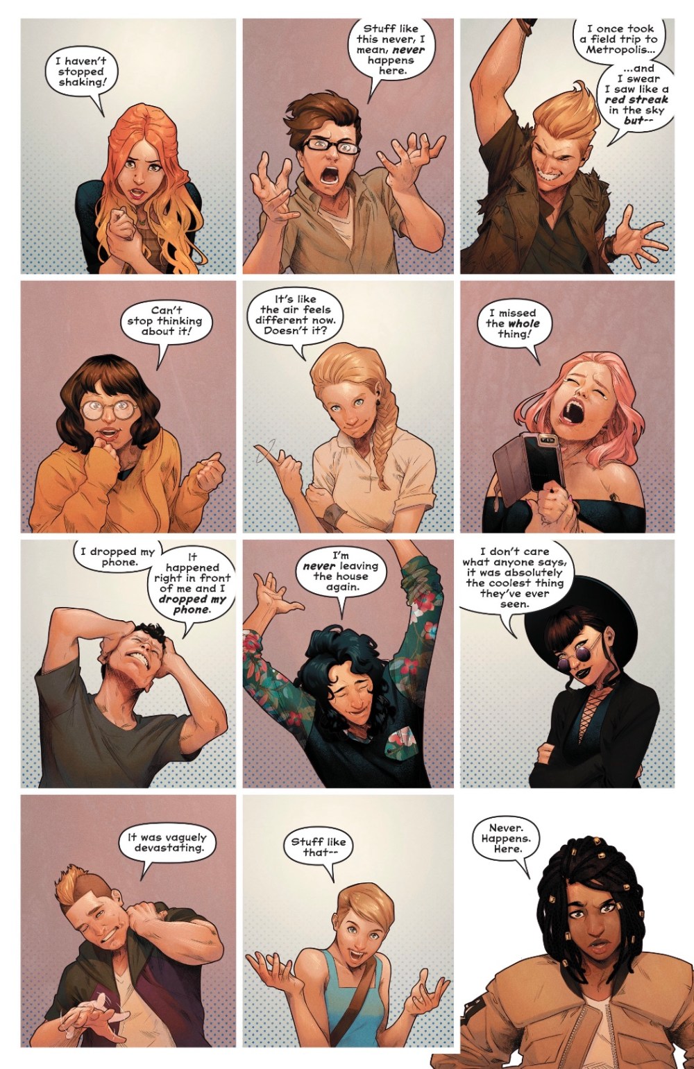
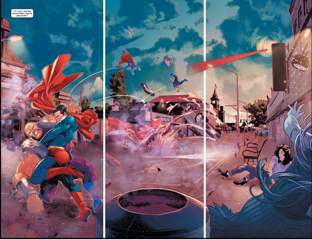 While pretty much everyone she knows catches a glimpse of the battle between the Man of Steel and alien dictator Mongul, Naomi somehow misses it. We don’t see the conclusion of the fight, but we do see the reactions of the townsfolk.
 That page opens this issue and it was a tad offputting – a massive wall of text in that annoying Marvel Ultimates kiddie font that, a lifetime of reading comics tells me, means people are whispering. Except they aren’t. Letterer Josh Reed uses it throughout the issue, presumably at the request of co-writer and former Marvel stalwart Brian Michael Bendis.
Happily, the page turn gives us a look at Superman’s visit to Port Oswego, and as illustrated by artist Jamal Campbell, in full colour, it looks amazing – hypnotic, dynamic. The whole book looks wonderful – Campbell works hard to present a wide variety of people, all with their own physical and personality quirks, as set up by Bendis and co-writer David F Walker.
And it’s a good job Naomi looks so great because this isn’t the most exciting first issue; and I don’t meant I want fight scenes all the way through, I’d like a little more variance in tone.
It’s quickly established that Naomi is fixated on Superman…
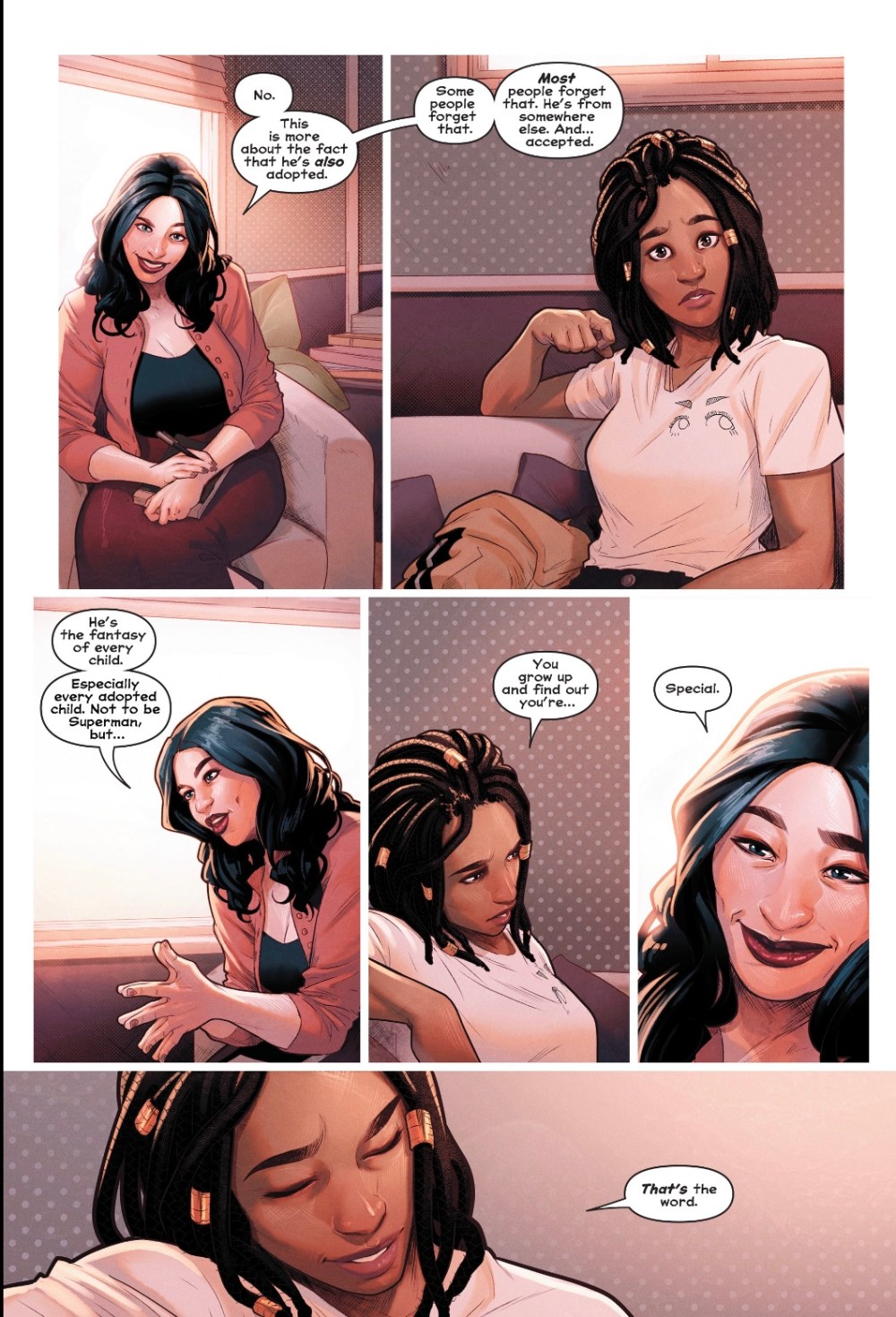 … and that there may have been a previous town encounter with a superhero, one the local residents – who come across as over-caffeinated Stepford Wives – are denying happened.
This is interesting, but terribly drawn out. An oldtime DC writer would have delivered this information in an eight-page back-up. Also, if you read the interviews with the creators around this book, there’s nothing that surprises – I was sure the issue would end with Naomi displaying Amazon strength or Daxamite vision or something, but the closing scene is pretty low-key. And despite being extra-length, this first issue doesn’t even find room for such basic details as Naomi’s surname. We’re not introduced to her adoptive parents, though they may be the first people on the vox poptastic page 18… presumably a deliberate choice on the part of Bendis and Walker, but still a tad irksome.
The dialogue is naturalistic without being over-mannered, the town is brought to life with charming detail – if Campbell can keep this up on a monthly basis I’ll be as amazed as I will be thrilled – and I’m interested in the basic mystery of Naomi’s links to the wider DC Universe. A little more pace, though, would be appreciated – I finished the story and didn’t feel half as excited by the book as I should. Naomi certainly needs a little more spark, she’s so low-key that she almost vanishes from her own comic, but pals Annabelle and Sooze have immediate four-colour charisma. Naomi smiles just once and simply glows, but other than that it’s page after page of her looking bemused, frustrated and grumpy.
Also, there’s a bit of a ‘fake news’ subtext going on, with a question raised about what the media doesn’t report and one key character saying: ‘I try not to talk about things I haven’t seen myself.’ This could get old very quickly.
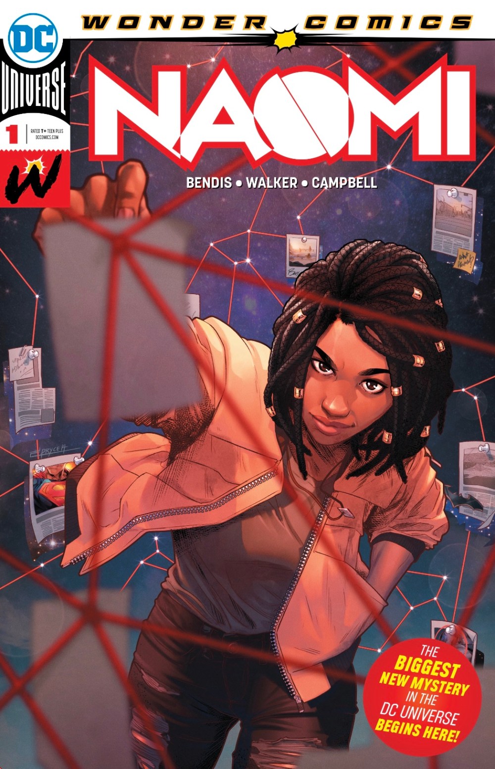
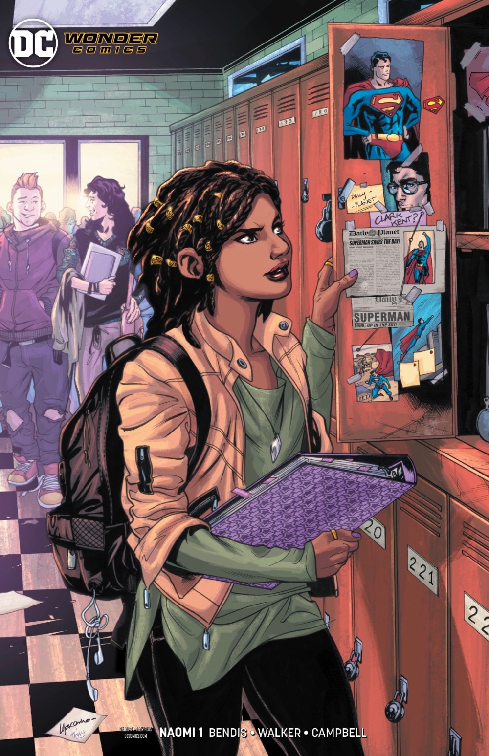 I like both the regular cover, by Campbell, which has Naomi as teen investigator in a 21st-century darkroom, and the variant by artist Emanuela Lupacchino and colourist Pete Pantazis, which hints that Naomi at least suspects Clark Kent is Superman. And that’s a nice logo – is the split ‘O’ suggesting Naomi is a child of two worlds?
I’ll certainly be back to find out more, this first issue was engaging enough to guarantee that – but an instalment that doesn’t scream ‘wait for the trade’ would be lovely.

I usually don’t read your reviews until after I read the issues but I had no advance feel of whether I’d like Naomi or not. Thank you ’cause it sounds like I’ll love it!
LikeLiked by 1 person
Brilliant! Let me know if you get a chance.
LikeLike
LOVED IT! The art, the flow, everything. Yes, the Ultimate font is a jolt in a DC comic, especially since it was always kind of a distraction when used at Marvel, but the colors! It felt like the first chapter in a book only illustrated. I’ve never minded decompression (especially when Bendis dialog is involved) and this was especially good decompression. I wouldn’t change a thing (except maybe the font) but especially that last page. Whoa.
LikeLiked by 1 person
I liked this one a lot, too — but definitely agree that I’d like to have gotten a little farther along in this story.
LikeLike
I think we have a hit!
LikeLike
Thanks Steve, it’s grest to find a new comic you love! I definitely like it, it brings a new flavour to the DCU… but I’m an impatient soul.
LikeLike