It’s 1939, the world is still reeling from the ‘The War To End All Wars’ and another World War is on the horizon. The vile teachings of fascists are touching a nerve in a United States only just coming out of the Depression. And in a Gotham ruled by gangsters, city leaders are being murdered by beast-men.

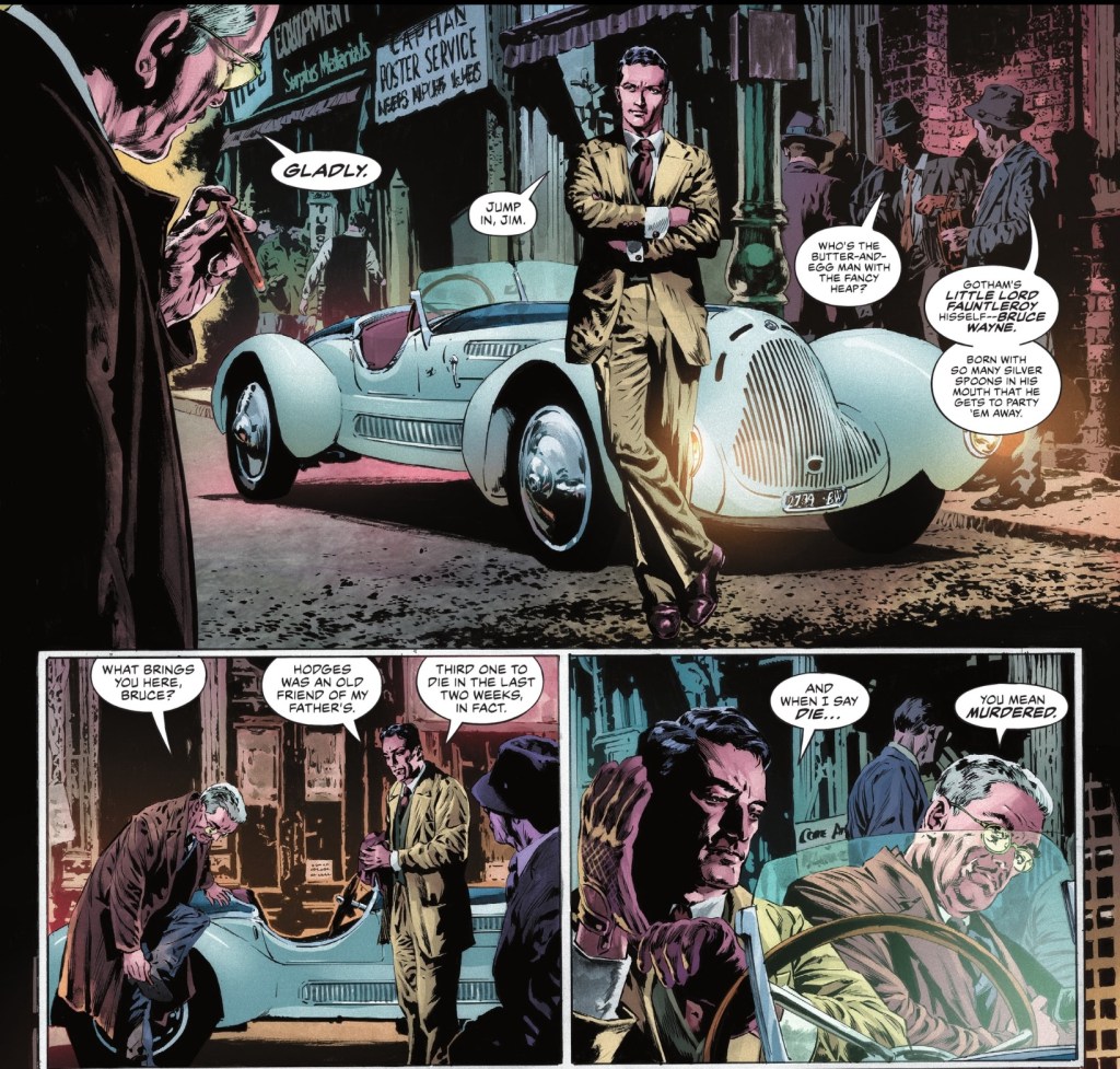
It’s obvious writer Dan Jurgens, artist Mike Perkins and colourist Mike Spicer know what they’re doing here. Taking visual and verbal cues from Warner Bros gangster films, they create an atmosphere that reeks of vice. It’s a more realised version of Thirties Gotham than Bill Finger, Bob Kane and Gardner Fox were able to give us in the earliest issues of Detective Comics. But there’s no doubt that’s where we are, with Batman wearing the original purple gloves, his cape like structured bat wings. Given that this opening chapter sees playboy Bruce Wayne meet movie starlet Julie Madison for the first time, but the Bat-Man has already solved ‘The Case of the Chemical Syndicate’ (Ace Chemicals cameos on the opening page), we can place this in between Detective Comics #27 and #31.
Not that it matters, I was pulled into this 48pp DC Black Label story, in the first of three issues, by the end of the vibrant opening spread. The creative team plunges us into a world of gangsters and good-time girls and it’s seriously seductive. There’s gore but it’s not gratuitous, with blood kept to the bare minimum. Jurgens’ narration and dialogue is whip smart, with perfect period terms and occasional actual swearing – none of your daft #@*!$&£. We see the huge pressure Commissioner Gordon is under, the cynicism of the corrupt cops. One man who doesn’t cuss is Bruce Wayne, he’s been very well brought up by the family butler who ‘moved on when I went to college’.
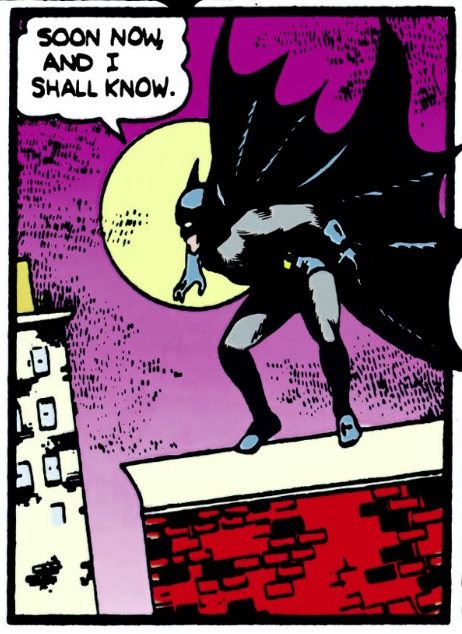
It’s a fair way into the chapter before the Bat-Man arrives, but goodness me, he’s worth waiting for. Perkins gives us a full-page splash that’s reminiscent of a panel from Detective Comics #29 but with the wow factor dialled up to 100. I won’t show that because it’s an earned moment, and I’d like you to buy this book, but here’s how Perkins and Spicer interpret Kane’s Bat-Man.
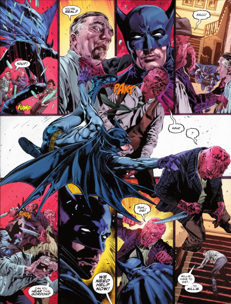
The only real difference is the belt, which is more ornate, and very attractive.
In a book that’s one great scene after another – I suspect his excellent art inclines people to overlook Jurgens’ writing ability – my favourites are our hero’s meeting with a local rabbi, Jakob Cohen, and film stars David Niven and Bette Davis.
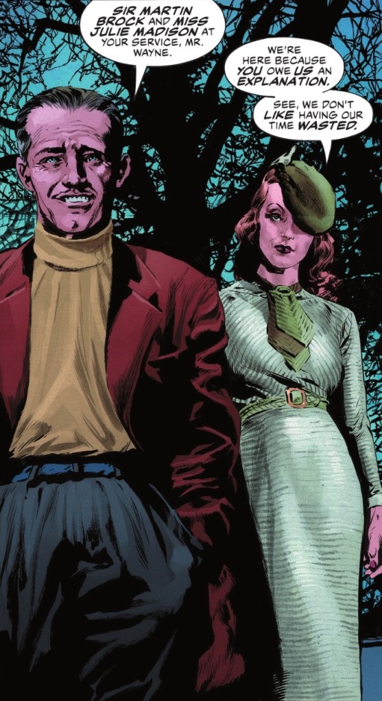
Oh all right, that’s Julie Madison and Sir Martin Brock.
What’s more, there’s a lovely detail in the Bat-Man’s first encounter with Gordon – he holds his cape over his face the whole time in iconic manner, presumably because Bruce Wayne is well known to the policeman.
Spicer’s skin tones and clothing textures are the best I’ve seen in a long time, and he gives the bad streets of the city – possibly photographs incorporated into the art, and why not? – an attractive glow. Letterer Simon Bowland hits all the dramatic notes, ensuring Jurgens’ well-paced script is a pleasure to read.
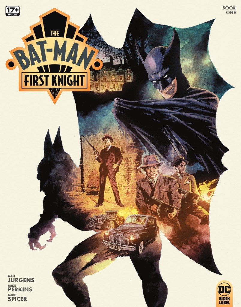
Perkins uses a famous panel from Detective Comics #31…
… as the framework for his moody cover, and it works rather well. And how about that art deco logo, for which we must credit publication designer Darran Robinson? A nod, too, to editor Matthew Levine for shepherding this instant classic.
I could go on all day about how brilliant this comic is, it’s a real labour of love, a fabulously crafted tribute to the early days of Batman. Or rather, the Bat-Man.
