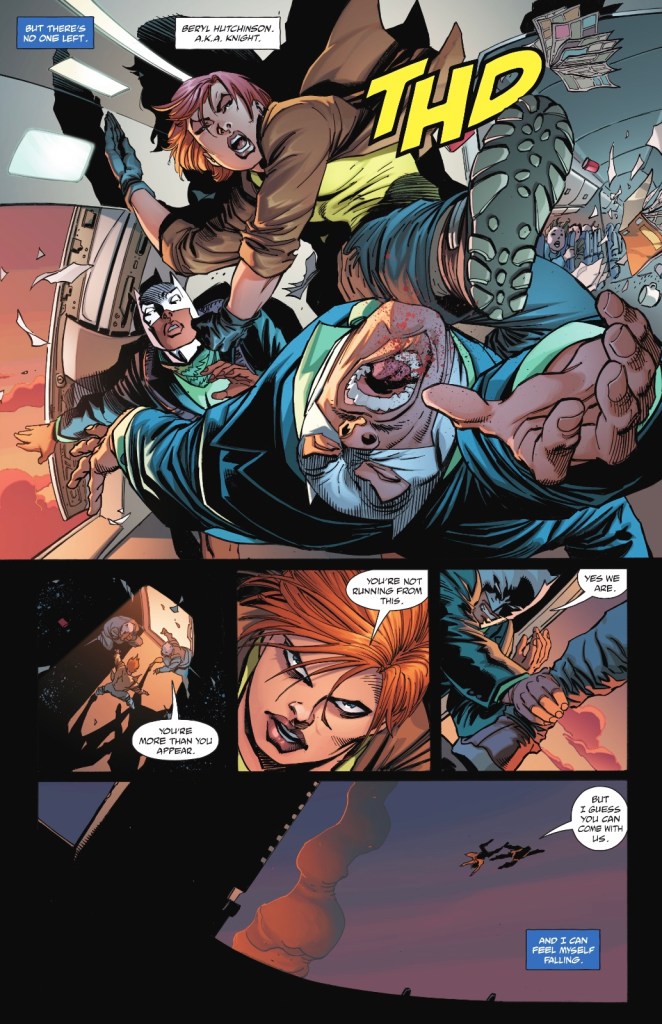
In the skies above England, terrorists in Batman masks plan to bring down a plane, leaping to safety themselves. One passenger won’t go without a fight.

Outside Gotham City, Bruce Wayne, in contemplative mood, is saying goodbye.

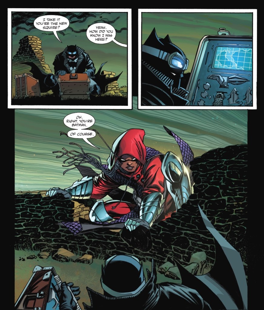
At the scene of the air crash, the Batman finds he’s not the only hero investigating.

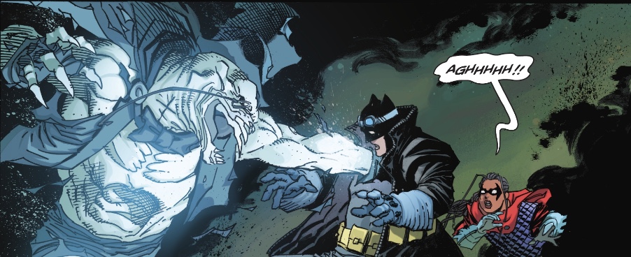
But there’s a villain around too…

I’ve been looking forward to this mini-series enormously. Batman in the UK, fighting alongside Knight and Squire, in a story by one of my favourite comic writers.
And indeed, Tom Taylor of Suicide Squad and Injustice fame produces some cracking moments of action, accompanied by simply edible dialogue. The mood of the piece is strong and there’s a mystery to be solved – I love a mystery.
There are problems, though. That opening sequence on the plane is accompanied by a voiceover which I took to be the thoughts of hero-in-civvies Beryl Hutchinson. I couldn’t marry the narration with what I know of her, so wondered if it was the female terrorist. Turns out, it’s Batman. One of those wee corner bat-symbols in the first caption box could have sorted that out and eased me into the story more quickly. If DC adds that to the inevitable collection, that would stop anyone else being tripped up.
And when is this story set? A quick caption telling us would be useful; I’m not following the current Batman, the pre-Future State set-up isn’t my cup of tea, but I know most of Bruce’s family money has somehow been appropriated by Lucius Fox. So is this Bruce downsizing, having had a rather cool haircut? Alfred is dead and the ‘family’ have moved on, but that could be every second Batman run of the last decade.
Or is this a speculative future tale, as hinted by Beryl being a few years older than last time we saw her, as she took on the mantle of Knight from her mentor, Cyril? Batman’s in a very cool winter look, but is it a future costume, or a logical reaction to the UK being rather chilly for much of the year. He talks about being old and bruised, but that could be mid-life crisis.
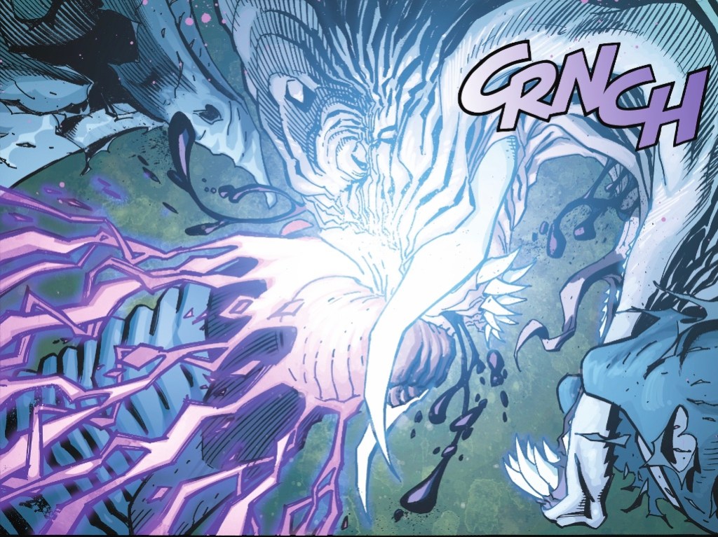
As for the art, Andy Kubert, in pencils and ink mode, gives us some excellent moments – the first look at Bruce, the reveal of the spook – and no one beats him when it comes to intense grimaces. There is the odd panel I couldn’t parse, this being the most troublesome.

I really couldn’t tell you which bits of the baddie and Batman I’m looking at.
Overall, though, I love the sequence on the Lancashire moors. That spectre – I’m deliberately avoiding their name – is an old DC villain in a new form and a brilliantly logical surprise. Batman has fought them previously so it makes sense he’s prepared for them to manifest.
As for the new Squire, Amina is as plucky as you could wish, and I hope we see her at the Knight’s side once ‘Beryl the Peril’ recovers from falling out of a plane. Beryl herself is on great form, down but far from out, her sense of humour always to the fore.
And I love Bruce’s musings on his two fathers, and references to his having been orphaned twice – Taylor gives Alfred the respect he deserves.
Taylor and Kubert’s partners in crime are colourist Brad Anderson, whose choices enhance the mood of every scene, and Clem Robins, the veteran letter who never makes a misstep – I especially like his alternate series logo on the splash page.
The cover logo is great too, I think it’s a take on one that would pop up on Nineties graphic novels. As for the image it accompanies, Kubert’s composition, attractively coloured by Anderson, sharply announces the series USP – Batman in the UK.
At six chapters, Batman: The Detective promises to be a tight, smart, good-looking series and, first issue snagging points aside, I thoroughly recommend this debut.
I had a lot of trouble comprehending Andy Kubert’s art in his story in Batman Black & White #1, but as we see here even color doesn’t always make things of his easier to see! I studied one panel long enough to finally make it out; a couple of other panels I just gave up on. There was a fight going on. There were what looked like visible parts of bodies. Good enough.
I guess colorists are used to making mental sense of what looks to me like an indecipherable patterns of lines.
I felt like this is supposed to be a much, much older Bruce, but how old was Beryl as Squire? She doesn’t look that old as Knight. Perhaps this could be 20 years later. Regardless of how much later, it’s an Elseworld. In the regular titles, the Tynion-Bat-family thing is ramping UP, not down.
Maybe this will be the start of a Taylorverse, taking its place alongside the Murphyverse.
I was hoping to be blown away more than I was by Tom Taylor, but there is still plenty of time. I doubt I’ll get happier with the art. This is just how Kubert draws, and though he does terrific layouts, I must admit an unpopular position that his name on it was actually a deterrent for me.
LikeLiked by 2 people
I’m glad it’s not just me who has a problem working out what’s going on at times. I also have enormous problems with Chris Bachalo at times.
Thanks for the Elseworlds clarification. They should bring back the cover colophon to make it clear.
LikeLiked by 1 person
True – but actually I’m just guessing it’s an Elseworld since Batman’s family is not currently missing and he’s in a different frame of mind, older and depressed, and is wearing a different costume. Not to mention in the current books he no longer lives in Wayne Manor (his fortune having been transferred by Selina to Lucius, who for some reason seems to think just because it was illicitly transferred to him, it’s his to keep and do with what he pleases! A former ally who is now a thief who is getting away with it.)
And now that he’s lost his fortune, he’s downsized to a townhouse in a nice part of Gotham. While DC has stated at the end of Death Metal that there is or are Elseworld(s), but I’m not sure anything is being titled that per se.
Technically half of what DC publishes is an Elseworld, “classic tales of classic takes on the classic characters,” disconnected from current continuity. Every digital first I can think of fits that mold. Every seasonal anthology story. The new run of Batman/Superman is based on visiting Elseworlds.
Future State was 2 solid months of “This could be a future.”
Tom Taylor has been their go-to Elseworld guy, but with his Suicide Squad series, and now Nightwing, he’s finally getting the jobs he deserves. I predict when Tamaki bombs out in Detective, Taylor will get that book. (This one is just a 6-part mini, so he will be free.) Tamaki will certainly bomb out. Her Wonder Woman run was awful, and her Future State contribution was poor. So far people have liked her on Detective, but I have some problems with it, and we’ll see how it fares.
DC art style employs three techniques I don’t see elsewhere:
1) Closeups, even extreme closeups. Little insets of action. These work in film, like a closeup when someone draws a gun. Maybe you catch what they show, or maybe you miss it. If I have the ability to do so (harder and harder with streaming), I can pause or slow things down. In comics, these inset closeups can be tricky. How many have I turned to right angles or upside down trying to decide what I am being shown? Kubert uses numerous little panels that leave me scratching my head.
2) Splash and double-splash collages – a swirl of action representing unseen “panels” where each scene is blurred into the next (mostly through the efforts of the colorist) and it’s up to the reader to try to figure out what elements belong to what scene being depicted, and what order to read the sections in. Does anyone particularly like that style? Imagine if an entire book were drawn that way – that whould separate the admirers from the haters.
3) Non-splash double-page spreads – where most panels are on one side of the page or the other, but at least ONE panel does cross to the opposite page. Sometimes only by a fraction of the inch. That single panel signals that the entire 2 pages have to be read left to right across the two pages. Sometimes I scan to check that no panel crosses the margin before I start reading, since DC does this in almost every book at least once. (It’s a problem in the trades, where it’s not just “edges” of panels that are lost to the binding, but it’s often the very center of panels that are being obscured.) I guess when you read digitally, as long as the person who formats the book gets it right, it is obvious what pages have to be read as one page across, because they will smoosh the pages together on one screen, everything reduced to 50% size. I don’t think I’ve ever seen this with Digital First books, though, where I think the horozontal “page” dimensions wouldn’t lend themselves to being laid out side by side that way.
Can you think of seeing any of these techniques used in a Marvel book?
The arists can work for either company, or many others, and the least difficult thing they probably have to do is adjust their panel shapes to satisfy a particular art director’s style guides. They know how to draw and lay out. Maybe they find the DC style as offering them far more leeway to be creative. (And conversely find the DC digital first style as being much more restrictive.)
And some artists, I’m sure, are free to just do their own thing. Kubert, Romita, Nick Bradshaw – their value is in the unique styles they’d developed.
Kubert didn’t do any collages or 2-pagers, and didn’t do extreme closeups, but did do some moderate closeups, and those weren’t always easy to make out. Several of the smaller panels fighting with the Ghost are kind of murky, beneath the weird one you pasted.
BTW I can’t make out much, but can see two of Batman’s gloved fists, glowing pink, right in the center of that panel. And one of his legs extending straight down from there. I guess the Ghost is leaning over from the panel right and his head is in Bruce’s torso, and his face is obscuring Bruce’s face. But maybe I’m just hallucinating. Nevertheless, it’s awful
LikeLiked by 2 people
I’m getting more and more worried about Future State’s status as a possible future, it really does seem that we’re going towards it a rate of knots via several books. Than goodness for all those stories outside the Infinite Horizon continuity, allowing me to ignored hardline Gotham mayors, Mongul and the like.
I’ve definitely noticed an increase in stories being told across two pages rather than one, pretty much from the arrival of Brian Bendis on the Superman series. It would likely drive me mad were I reading them in physical comics, it’s just gutter madness! I’m probably not reading enough Marvel Comics these days to have noticed a contrast with DC, I’ll check some out on Unlimited.
Even with you untangling that panel, I still can’t see it!
LikeLiked by 1 person