
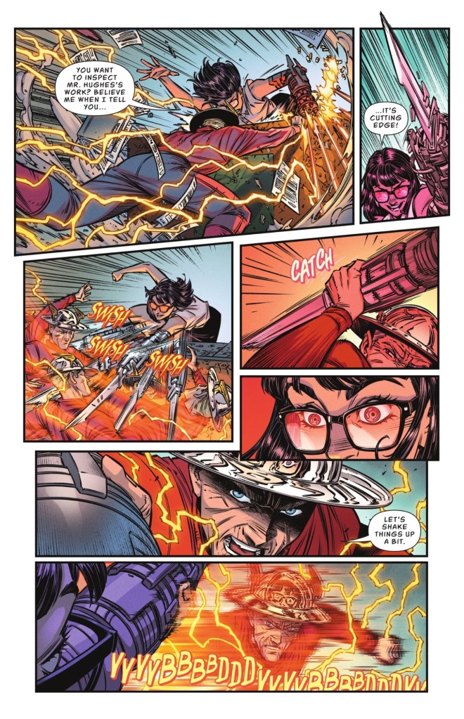
We start with The Flash and The Boom under attack by a STAR Labs secretary who has shown her true colours. And they’re shiny.
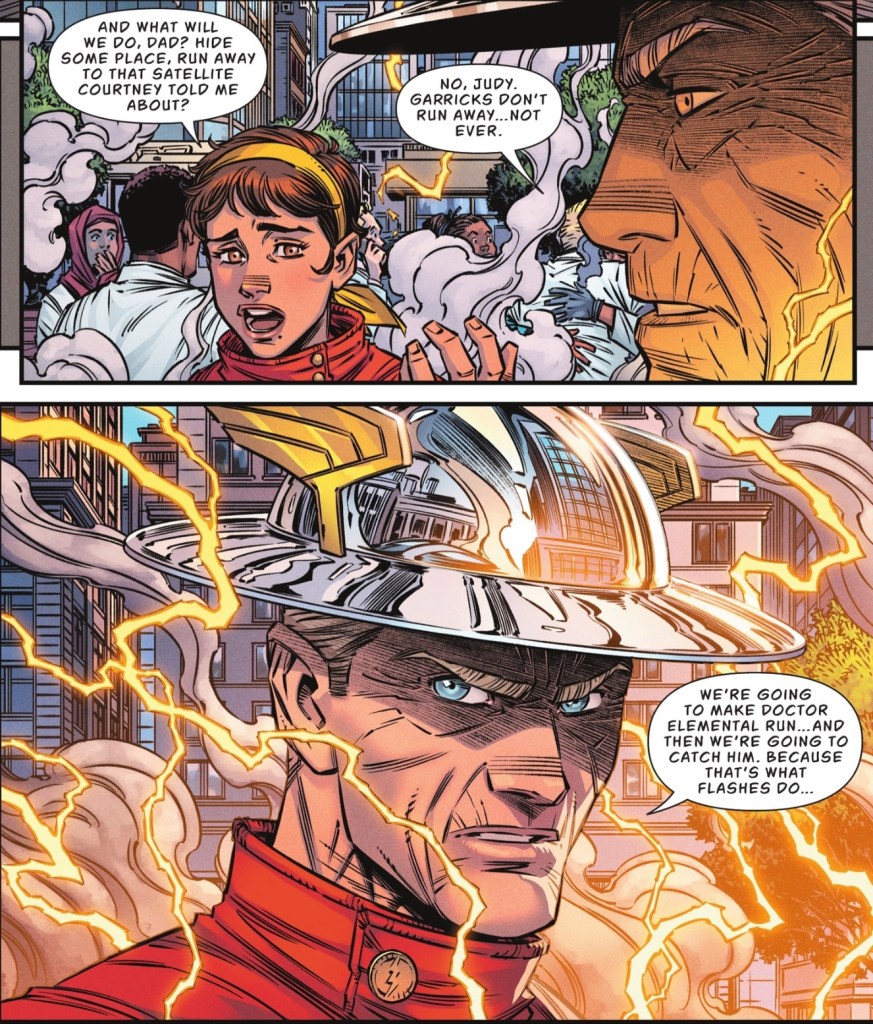
Learning that it’s offspring Judy who robot controller Dr Elemental really wants to get his hands on, Jay decides a father-daughter trip is called for. And it involves seeing his own doctor.

If you don’t recognise the chap in the shades, it’s another member of the Justice Society of America…

And that’s the barest indication of this issue’s contents. If you’ve been following my reviews of Jay Garrick: The Flash you’ll know how delighted I’ve been with story and art. If not, feel free to start here. Or, and this is what I’d love you to do, pop to your local comic shop and just buy the lot. If you have DC Infinite Extra, go there and catch up. Seriously, this isn’t just my favourite of DC’s New Golden Age books, it’s my favourite DC title full stop.
The story by Jeremy Adams is beautifully plotted and his script full of sharp lines and personality – this month’s pun-off between Jay and that steely secretary is a hoot, but it doesn’t delete the drama. Flash Sr and Jr, even though they’re only recently reunited after decades of being apart, have great chemistry. And Adams shows us the fighting spirit of a true hero.
And what a treat to see the third Dr Mid-nite back in the DC Universe, what with the second being back from the dead in the JSA series. He’s a great addition to this mini-series, and even gets a little catchphrase all his own.
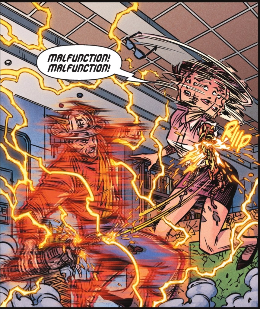
As for the visuals, just look at these panels. Diego Olortegui’s dynamic art matches the excitement of the story – the figurework, the fight scenes, the background detail… check out the reflections in Jay’s helmet throughout the chapter, this is polished work. And the tightness of Jay’s skin is a testament to his age, but he’s still a handsome gent. What’s more, Olortegui is up there with the best artists of DC’s past when it comes to showing super-speed – the frenetic linework is perfect.
The work we’ve seen over the past five issues is a true labour of love and a marvellous showcase that, if there’s any justice, will get Olortegui a lot more DC work.
I’m also very grateful to Luis Guerrero, whose colours bring Jay and Judy’s world to blazing life, especially when it comes to completing the speed effects. Every page has wonderfully balanced tones, with the Brazil-beach scene making me want to get on a plane right now (and the Ronaldo shirt Olortegui sneaks in is a terrific nod to the real world). Longtime letterer Steve Wands brings his A-game, as ever, with the robotic font especially fun.
As for the cover, it’s another in-yer-face action moment from Jorge Corona and Sarah Stern which no one could ever accuse of not being colourful enough.
If I were a DC high muckamuck I’d be commissioning an ongoing The Flash and The Boom series right now. If the sales of this mini-series aren’t stratospheric, so what, promote the heck out of it – the quality is right here, before our eyes. Tell the world what they’re missing! Show a little faith in a comic that uses the breadth and depth of the DC Universe, building on classic characters and scenarios to bring us something new, something glorious.
If you haven’t tried this series, please, give it a go. It’s what Joel Ciclone would want.

Nice review! Many of my own thoughts echoed! It IS great to see Pieter Cross again. Adams used him in his Flash series at one point. I could really get behind a Flash/Boom ongoing…if only…!
Matthew Lloyd
LikeLiked by 1 person
Gosh Matthew, how did I forget that?
LikeLike
I still don’t have fond memories of Johns’ mini that dumped a ton of ridiculous continuity inserts into the Golden Age characters but it was responsible for this amazingly fun book. This installment barely moved the needle but I enjoyed it so much I didn’t notice until I was done. I’m not a fan of the art but the story carries me past that too.
LikeLiked by 1 person
Glad you managed to have fun with the comic despite everything!
LikeLike
I’m not quite as on board with this series as you are, Mart. I love Adams’s work, but I feel like this story could have been tighter. I wish we’d gotten this as a 4-part story, and then a different two-parter, for instance. But the comics industry doesn’t work that way anymore.
But mostly, I think I’m a little less high on this series because the art doesn’t hit with me as well. And I think that might be due to first impressions: Diego Olortegui’s art on the pages you show is good — it’s similar to Scott Kolins’s work, but with a little more manga influence. But I haven’t warmed up to Jorge Corona’s covers. The colors are great, but for some reason they don’t excite me. And so with every issue, I’m starting out on the wrong foot.
LikeLiked by 1 person
Ah, those covers. I said nice things about the first, was a bit sniffy about #2 and #3, and was pretty woolly about #4 and #5… I suppose you could read ‘Jorge Corona and Sarah Stern supply another bright and busy cover image’ and ‘it’s another in-yer-face action moment from Jorge Corona and Sarah Stern which no one could ever accuse of not being colourful enough’ as outright compliments!
LikeLike