Cards on the table, I bought the first issue of this anthology because I love Superman. The promise of timeless material, stories unconstrained by current continuity, was irresistible.
And I still haven’t read the darn thing. There’s something about the USP – stories in which the title colours are to the fore – that puts me off. Batman Black and White makes some sense, because comic stories begin in black and white, and as a UK reader, I grew up with that as the default. But red and blue as Superman’s signature colours? That yellow is pretty important. (The upcoming Wonder Woman Black and Gold makes even less sense – if Superman is red and blue, then so is Wonder Woman, black is nowhere near being a signature colour for Diana.)
I looked at the comic, and the literal coolness of the pages put me off. I was going to read it at some point, but oops, here’s another Tuesday with lots of new comics demanding an immediate read… the timelessness of the SRaB tales worked against the book getting read.
Yet here I am, having skipped the other issues, reading the sixth and final number. The reason? I heard it featured Streaky the Supercat, in their very own story (the pronoun choice is due to Supergirl’s pet having been inconsistent of gender down the years). And here’s the gist of Hissy Fit.
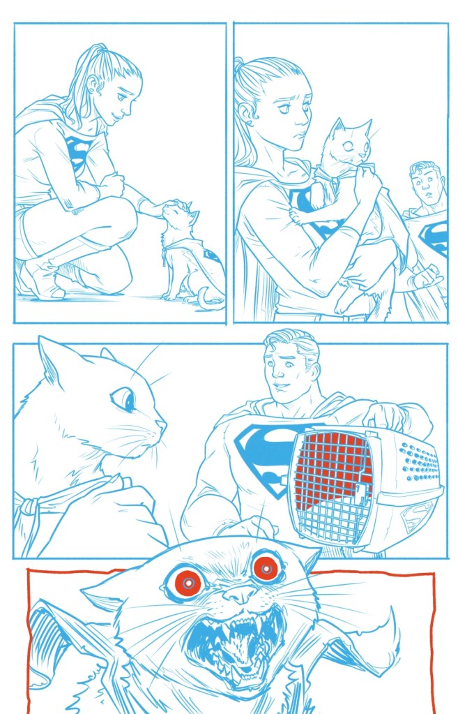
The Super Cousins are moving Fortresses of Solitude and someone isn’t keen on their kitty carrier. It’s a scene that will chime with every cat owner. Sophie Campbell’s story is cute and I like the art – bar Kara’s ‘council house facelift’ hairdo – but the predominantly blue pencil effect makes the pages look like a first draft. The sudden reds are effective in showing us where the intensity lies, but full-colour would be lots better. And I dislike silent stories, unless there’s a great reason, and here there isn’t – the best Super Pet stories have them thinking charming thoughts.
Still, it’s a Streaky story, I liked it, and more DC work from the talented Campbell would be much appreciated.
The Scoop, written and drawn by Matt Wagner, and coloured by his son Brennan, uses the restricted palette to better effect, with tones and tints varied for mood. We’re in the realm of Max Fleischer, with Clark Kent and Lois Lane in full newshound and newshen mode, and giant robots-a-go-go. The dilemma? How can Clark grab the Daily Planet front page when a) he’s too modest to big up his alter ego and b) he prefers writing decidedly unsexy ‘explainers’.
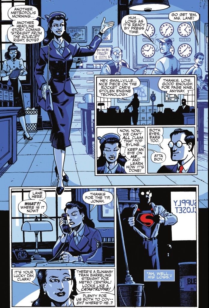
It’s a lovely, smart piece, and very true to Superman.
The same can be said for The Special by Tom King and Paolo Rivera, which shows the interactions of three generations of the Kent family with Smallville diner waitress Annie. Kindness and humanity are the core of the story, with a cracker of a Pa Kent Inspirational Speech and one of the cutest Jon Kent moments ever. Rivera’s storytelling and finishes are gorgeous, while writer and artist together use the colour conceit to great advantage to give us a thoroughly touching ending.
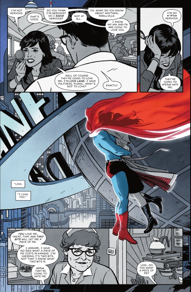
Rivera’s floating kiss has to be one of the most romantic, gorgeous Superman and Lois moments ever.
But – and there doesn’t have to be a but, but there is one – would someone at DC please stand up to King and rein in his love of swear words? I accept that modern comics will have people #%@%#!ing in moments of high drama, but people in Smallville, and especially members of the Superman Family, do not curse as a matter of course. The first panel has sweet Annie swearing as she drops a plate, for crying out loud.
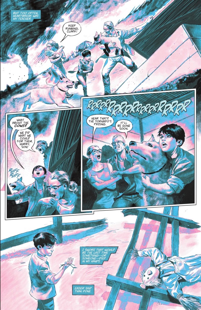
Ma and Pa Kent pop up again in Son of Farmers, a gentle tale showing how the lessons of the land taught by Martha and Jonathan made Clark the man he is today. It’s a nuanced take on a Superman trope, and even had the story not been a winner, Steve Pugh’s art would, like Superman swooping in, have saved the day. His visuals are always great, but this is the first time I’ve seen colour work from him, and it is stunning. More please.
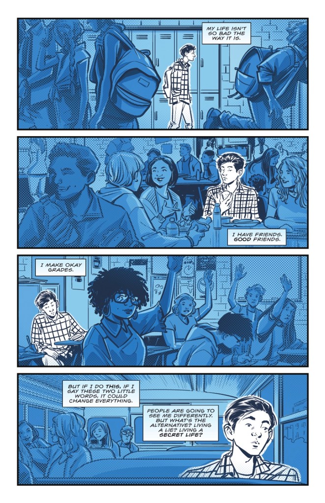
Upsetting my expectations as to what this series is, but not upsetting me in the least, is Ally, which does indeed tie into current Superman continuity. Specifically, Superman’s recent revelation to the world that he’s also Clark Kent prompts a young man to risk a step into the unknown, and a better future. Rex Ogle’s story isn’t terribly surprising, but it’s exactly what I wanted it to be, while Mike Norton uses colour to show how our unnamed protagonist – a wonderful design – feels apart from his fellows. And the final two pages are the perfect note on which to end the whole series.
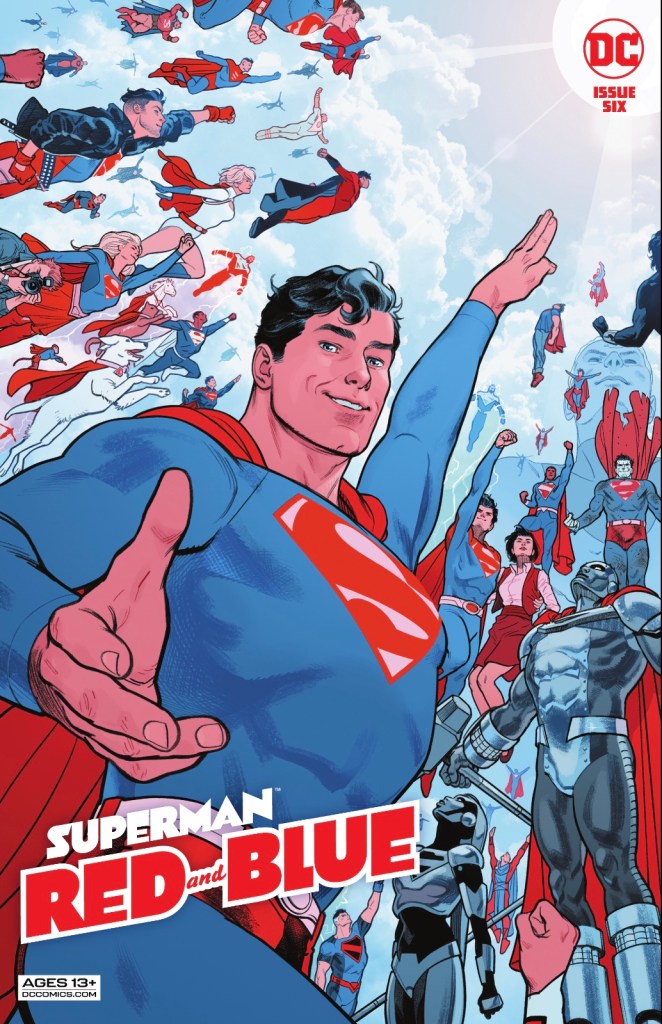
Topping off a consistently fine issue is Evan ‘Doc’ Shaner’s cover image of a beckoning Superman, his family members, alternate versions and heroes he’s inspired. It is just edible.
Lest we forget, the letterers are Steve Wands, Dave Lanphear and Pat Brosseau, the production design is by Darran Robinson, production is thanks to Sunny Paradyse and the editors are Brittany Holzherr, Diego Lopez, Jamie S Rich and Bixie Mathieu.
Superman Red and Blue #6 is a wonderful comic. I think it’s time I went back and read the other five issues.
I did read the first issue and never came back. The limited color pallet actively worked against my enjoyment.
LikeLiked by 1 person
I can well believe it. I’m waiting for Green Lantern Green and More Green.
LikeLike
Steve Pugh’s work looks exactly like the color treatment he used in Harley Quinn: Breaking Glass. It also used just red and blue (most of the DC YA books use very limited palettes), plus there’s something about the artwork itself that is different from the way he usually draws. Maybe when he knows he’s going to do the coloring, he uses a lighter touch on the “inking” and lets the color do most of the work. There’s nothing but color on a lot of it, especially the backgrounds, so the panels seem to glow.
This series was by far the most colorful of these anthologies – lets not forget this one has black as well as red and blue. If it had only been red and blue, it would have been tiring. Not that they’d all look as unusual as the first story, though that is an example of what can happen when you leave out the black entirely.
They are all using black and grayscale.
Harley Quinn Black + White + Red added just red
Batman Black & White stuck to black and grayscale
Wonder Woman Black & Gold is adding shades of yellow
Using red and blue, this one is at times close to a full-color comic.
In general I haven’t been buying these, out of DC anthology fatigue and DC high price fatigue.
(Didn’t we just have Wonder Woman #750? Now we’re going to be getting Wonder Woman 80th Anniversary. Feels like we’re repeating ourselves.)
In the end I picked up the whole Batman Black & White series, after a very rough start with the first issue. In my opinion, that #1 was an awfully difficult one: only one story, the one by G. Willow Wilson and Greg Smallwood, looked like I was expecting, and was more like the stories in the issues to follow. But the art in several of the stories was difficult to decipher – drawn as if with the expectation that color would be added, so they had insufficient contrast from shading. Then, J.H. Williams III drew an all-montage story, not my favorite style. And they let the Spanish artist Emma Rios write her very first story, a pretentious poem in English. Even native English-speaking experienced comic book writers aren’t necessarily good poets, so what we have here is a non-professional first time writer, Spanish speaker, doing poetry?! It was too impressionistic to understand. (No reviewer quite knew what it was about. I kept thinking it was about Batman emerging from the Lazarus Pits, though the hypothesis didn’t entirely fit.)
The series picked up after that issue.
But I have no idea why DC led with such an off-putting first issue. The story choices actually made me angry. I think they must have lost 50% of the audience after that one.
LikeLiked by 1 person
I have an issue of the Black and White Comic, I heard there was a good Riddler story in there. I tried it, found it unreadable and that was the end of that! Thanks for the great rundown of contents and how different artists have approached the books? Have you not got a blog to which I could subscribe?
LikeLike
I don’t have my own blog, and wonder if my limited narrowly-focused observations could really stand on their own. I tend to miss the forest for the trees, and throw darts (and praise) at comics from the sidelines.
But if my verbose posts make it seem like I’m too lazy to start my own blog and just find it easier to hijack your comments section – ouch, but that could be true, and I apologize! This is a nice forum for discussion, though, where people pleasantly and intelligently engage.
LikeLiked by 1 person
Heck no, I don’t mean you were hijacking, I love your comments – I thank anyone who reads and anyone who responds…. I just wondered if I could read more. Don’t even think of leaving this place. I’m so lucky you all chat to me!
LikeLike
Count me in the minority, then, as someone that really enjoys the colouring choices for Superman Red and Blue (and Wonder Woman Black and Gold). In terms of story-telling gimmicks I much prefer this limited colour palette to wordless comics (barf) or prose stories told with pictures (John Ridley’s The Other History of the DCU I’m looking at you).
But even setting aside my dislike for those two story telling choices, I really enjoy the way these books look. It’s not much different than a black and white comic… except that there’s a splash of colour added in, with that colour often being used very effectively to highlight an important moment, or emphasize the theme. I’d be more than happy to see a Flash Red and Gold, Green Lantern Green and Greener, Aquaman Gold and Green.
LikeLiked by 1 person
I reckon we should get a discount because they’re paying for fewer colours! (That gag copyright 1962…j
LikeLike
I don’t even recall seeing this series on the stands before #6, but I picked it up for Matt Wagner, because I’m in the tank for anything he draws, and for his ability to capture the classic spirit of DC’s icons. And once again my faith was not displaced.
(Fitting he’d be here, since his Grendel: Black, White & Red and Red, Black & White series in 1998 are clearly the precursor for these color-framed series now. I mean, Batman Black & White came first, but you can’t call “print ’em in black and white” an innovation …)
Loved the Streaky, pure fun, and relevant to current pet situations here at home. Bought #5 at the same time for the sweet Krypto cover/story, as well, and enjoyed both issues. I think if I sat down to compare, #5 and 6 have better material generally than in the first two issues of WW: Black and Gold, which I’m also enjoying.
I agree with you on the swearing, and it not belonging in the Superman world. Swearing has its place (I do it far too often/easily myself), for instance in Vertigo-type “mature” comics, but even then, spell it out. My rule of thumb is that if you can’t spell out the word, then fake-swearing is also inappropriate in the context. (In my journo days, I really hated any instance of a story bleeping out words in such a way that I still know what the word is. “S_ _ _” still puts that word in my head, so if the idea was to not put that word in my head: failure. Now we have it in headlines and book titles, and I sound like the cranky old man I was always destined to be.)
LikeLiked by 1 person
Oh wow, great memory, I’d forgotten there’d been a Grendel book of this ilk… I’ve not read it, but I’ve definitely heard of it. I hope your pet(s) are feeling calm! So far as newspaper bleeping is concerned, at our place we can print anything but the F word and the C word, but really, unless there seems to be a really great reason for dipping into the old bag of asterisks, I’d just delete them.
LikeLike
I’ll have to get this for Streaky and for Matt Wagner!
LikeLiked by 1 person
You won’t regret it!
LikeLike
I finally read issue 1 of this series — I’d been waiting for it to arrive on DC Infinite — and I enjoyed it. I’m not quite sure if I’d have been as high on it for its full cover price, but I liked the stories it presented — and especially a story that starts in black and white, and John Ridley’s callback to an old Bob Haney World’s Finest story, taking the events of that issue at face value and treating them seriously. It’s something I’m absolutely amazed was published. “Everything happened,” indeed!
I’m looking forward to more.
LikeLike
Well, you made me read it. What a dull, depressing way to begin a new Superman series!
LikeLike