
‘A new story from a classic era’ is how Marvel describes this four-issue mini-series and based on the first instalment, this could prove a classic itself. So far as meeting the criteria of the quote goes, ‘new’ it most certainly is, and as for ‘classic era’, that’s fair – the costumes and presence of toddler Valeria tell us we’re back when the late Mike Wieringo was drawing the book and Mark Waid was writing it. (OK, the logo is wrong, but who’s that picky?) ((Don’t answer that!))
And look, here is Waid, and there’s another legend with him – the great Neal Adams. I understand that this project came about because Adams has never drawn a Fantastic Four comic and wanted to rectify that (I remember his version of the FF from a Bronze Age Avengers issue but they turned out to be steenking Skrulls, so that doesn’t count).
Well, he certainly gets the job done here, aided by the sturdy inks of Mark Farmer and colour artist Laura Martin. Adams is in his 80th year but this work is as sharp as anything I can remember from him. Compositions are strong and clear, characterisation on point, the energy is off the scale… this really is a beautiful superhero comic. I especially love how much expression Adams gives Reed, Sue, Johnny and Ben, and how expertly he shows the human musculature. He does great aliens too, as the opening image of longtime FF foe Annihilus shows.
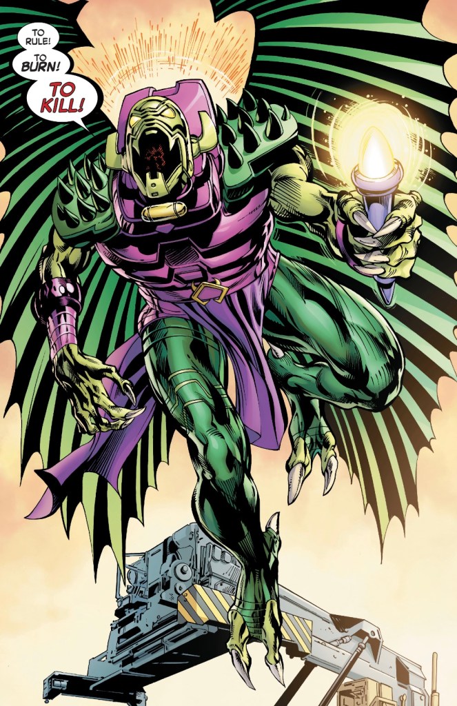
The story starts in media res, with the team confronting the master of the Negative Zone after other-dimensional rifts appear around New York. It’s just another day at the office for Marvel’s first family.

Sue reckons Reed’s absent mindedness is him being even more distracted than usual, for reasons she doesn’t know. But she doesn’t seem too worried.
The FF’s plans for a quiet weekend go out the window when a meteor of unknown origin threatens New York. Of course, Reed has a plan.
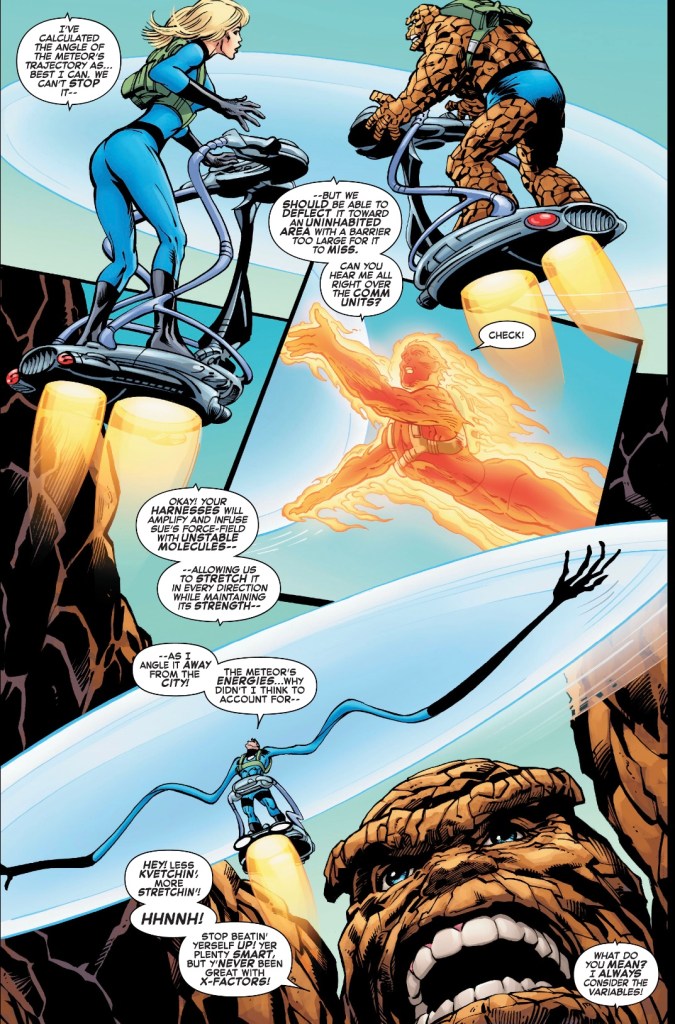
The next line is worth the price of the book.
By close of play the meteor has been sorted and the team’s old pal Norrin Rad has shown up, and in quite the state – something I wouldn’t spoil were the Silver Surfer not right there on the cover.
I loved this. It’s a gorgeous looking, beautifully written Fantastic Four story. While the pencils by Adams are the USP – though let’s not understate the talents of embellisher Farmer – it’s a massive treat to have Waid back writing. Sue, Reed, Johnny and Ben are their classic selves, four very different people who coalesce into one formidable fighting unit. I love Annihilus (despite always having to check that spelling), his attitude and visual is a winner, while the dynamics of the team are spot-on – we even get the traditional Ben-Johnny play-fight. Reed’s distracted manner will hopefully go somewhere – I’d be disappointed were it to prove a feeder plotline for that awful ‘solve everything’ mindset he had during the later Jonathan Hickman run.
As for the Silver Surfer, he’s not a favourite – too whiny, except when Dan Stott writes him as a totally different character – but I’m sure Waid will do something interesting with him. At the very least, Adams, Farmer and Martin will make him shine.
Martin does an excellent job, keeping things bring and airy rather than going for the muted palette so many comic books favour these days. I especially like her painting Annihilus as shockingly green and purple as he’s ever been. And letterer Joe Caramagna makes the words as readable as one could wish for.
The only question I have about this project is, why the heck isn’t it a 100-page treasury edition? It’s Neal Adams drawing the world of the Fantastic Four! I do hope Marvel are simply double dipping and will collect it in the classic format, as they did with a recent Silver Surfer project.
For now, I’ll be like Galactus and enjoy this Marvel meal in bite-size chunks. I recommend you do too.

So I should get over the fact I really, really don’t like Adams art and read this?
LikeLiked by 2 people
As Rob says, I’d go for something you’re more likely to enjoy fully.
LikeLiked by 1 person
I was weak but won’t be for the further issues. Waid’s script seemed to be not up to par either but he’s good at pairing his writing style to match his artists…
LikeLiked by 1 person
“Adams, Farmer and Martin will make him (Silver Surfer) shine.” Heh. I see what you did there.
It’s strange how in his early days, Adams’ art was touted as being realistic. Now, in his later years, you can see the cartoony-ness that has always been there. There’s something off about his Thing, though.
LikeLiked by 2 people
I think it’s the mouth… I actually went and checked whether Ben usually has teeth showing!
LikeLiked by 1 person
The teeth were jarring but them changing shape and size as much as the Thing’s shape and size varied was worse. I thought he must have been given a bad character sheet to use as reference but then realized he had to have been given multiple character sheets done badly and all different…
LikeLiked by 1 person
Steve, I liked this book a lot — but if you really don’t like Adams’s art, I’d say leave it alone. It’s a fun book — but there are other fun books out there where you’ll like the art. This one won’t change your mind.
LikeLiked by 2 people