
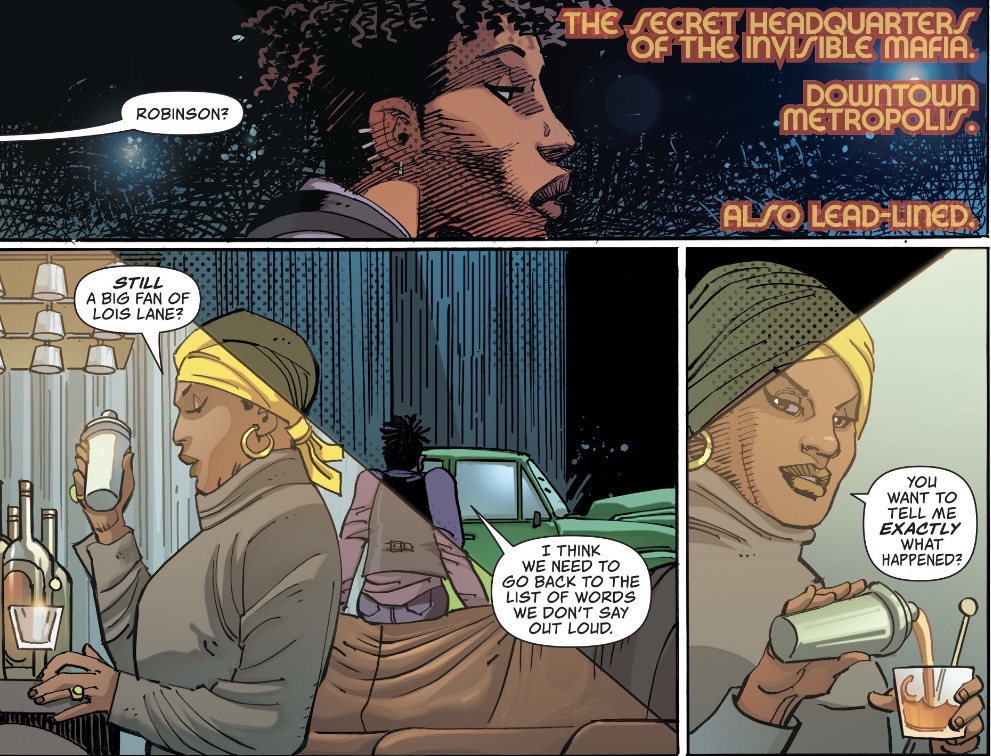
‘Clark Kent walked into a bar.’ It sounds like the beginning of a joke, but it’s no joke for the Invisible Mafia members when Clark Kent, newly revealed as the Man of Steel, shows up. Why is he there? Let’s go back a few pages, to the start of Action Comics #1023.
After a very detailed recap courtesy of Fortress robot Kelex, we catch up with Lois Lane and Jimmy Olsen, who last time were lured to the Invisible Mafia’s secret meeting place. The reporters find dead gangsters and their killer.
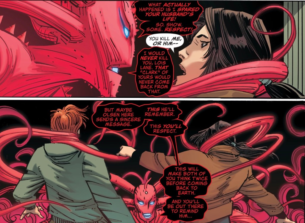
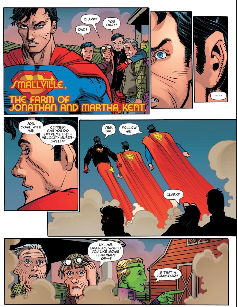
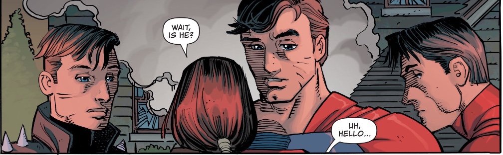
With one magic word, ‘Smallville’, Lois summons her husband to her side, away from a happy reunion at the Kent Farm in Smallville.
The villainous Red Cloud proves a challenge even for three Supermen, but eventually they blow her off. And Jimmy has a revelation.
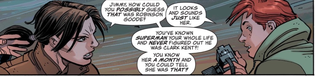
And that, along with Brainiac 5’s tractor moment, is my favourite panel of the issue. Maybe it’s because he’s a photographer that Jimmy looks differently, more likely it was a random Eureka moment… and I don’t buy for a second Jimmy’s subsequent claim that he still doesn’t believe that Clark is Superman, we’ve already seen him deal with that one – he’s just messing Lois around.
The big surprise this issue is that Red Cloud is suddenly so anti-ET, constantly spouting ‘aliens go home’ dialogue. Mind, she confuses me several times this month. That ‘coming back to Earth’ comment above, for example, what’s that mean? And later comments about Superman not liking Jimmy as much as she thought, what are they all about?
There’s more confusion when Lois, meeting Conner for the first time in her current memory (it’s comics, go with it), asserts that ‘he looks like if you and Lex Luthor had a baby’. Come on! No one has ever drawn Conner Kent as anything other than the Superman clone he once was; even that time he was bald, he still didn’t look like Lex.
And this had me scratching my head…
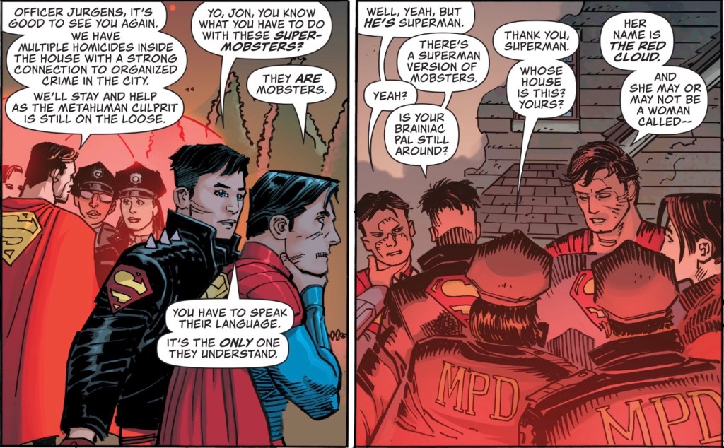
… I think it’s Conner hatching the plan enacted after Clark walks into that bar, but all the ‘super-mobsters’ talk is confusing – the only person around meeting that description is Red Cloud. (And could someone tell me what her powers actually are? Red smoke that bugs super-people, but why is it such a problem after all this time? Is it mystical?)
Superman seems as confused by Red Cloud as I am. A couple of issues ago it seemed that she was on a path to redemption, but here she is cackling away like a regular super villain. No wonder he’s disappointed. I’m actually glad writer Brian Michael Bendis has gone this route, Robinson Goode had been too bad by the time she showed flickers of remorse – there’s no way she could come over to the side of the angels; I suspect that the more time she spends in her misty form, the madder she gets.
Penciller John Romita Jr and inker Klaus Janson, they’re certainly maddening, their Superman and Conner are so off model it’s not true – there’s one panel in which I wasn’t sure whether I was looking at Conner or a newly arrived cop.
And those scratches they continue to put on the face of Superman….
With Ma and Pa Kent, the artists have Licence to Wrinkle, meaning they look like mummies. I’ve seen Romita and Janson do so much better over the years, what is going on in this comic?
They do a fine Jimmy, though, and Lois has character without looking like Groot, which I guess is a win.
I do like Romita’s staging, the way he places characters on panel, telling us about their personalities, how they relate to others. The way they dress, too.
Once again, colourist Brad Anderson is asked to fill several pages with red hues and as previously, he uses contrasting tones around Red Cloud’s super sweat (well, it could be!). so as to avoid monotony. Letterer Dave Sharpe earns his dosh by the end of that opening recap page, it’s commendable he actually makes it to the end of the issue.
Superman’s hideous face apart, I like the cover by the interior artists, it’s nicely composed by Romita, finished by Janson and coloured by Anderson. Extra points for that melodramatic word balloon.
Hmm, I never did say what happened when Clark went into that criminal bar. Let’s just say that when you have a visiting Brainiac 5, you get to think small.
I enjoyed this issue but it’s a step down from recent ones; Red Cloud’s altered personality made for a bumpy ride, and I find myself irritated by Romita and Janson’s inconsistency. One good thing is that the Invisible Mafia plot looks to be wrapping up; I’ve enjoyed it, but it’s time to move on. Send Red Cloud to the Phantom Zone, let Marisol Leone escape to Oolong Island or somewhere… I’m ready for some new challenges.
Rating: 6/10

When this all ends, I want Miss Leone to arrange a pardon based on all the info she has to be hoarding. Then Jimmy can hire her as publisher because she actually was pretty good at that. He’d just have to add a nor murdering or being an accessory to murder clause to her contract…
LikeLike
Ha, that’s a superb idea, tweet that man Bendis!
LikeLike
To date I’ve been ok with Romita’s work and even liked quite a lot of it, but this time…. so much is almost too painful to look at. Janson’s inks do Romita no favors.
Is Agent Chase wearing a bowler hat? Or what is that on her head?! I guess it’s supposed to be a police cap, but it’s as much a cap as Chase’s face is human and not a pumpkin with features carved into it.
I think Red Cloud was never on a path of redemption – turned out she just wanted to kill Superman on her own terms, not Leviathan’s or Luthor’s.
The story is a mess, so I’m hoping Bendis gets it together. I find myself liking the Red Cloud less, not more, over time. Don’t know what she’s screaming about or why she hates the Kent family and friends so much. Is she threatening to suffocate them all if they don’t leave Earth? But what would they breathe in outer space? I guess she thinks that’s not her problem.
LikeLiked by 1 person
I assumed that was indeed an FBI cap Agent Chase was wearing… I’ve said it time and again, artists should take into account Guided View when drawing. Or simply the fact that not all readers have rotten eyesight.
LikeLike
I usually still buy print comics. That cap looked so weird that I checked online, and it was only by zooming in that I could see it was supposed to be a law enforcement cap. So it actually looks worse in normal size. On the other hand, Chase’s face looks worse the more you zoom.
Anj’s review of the old Supergirl story today reminded me how different Romita’s work looked when he drew Linda Danvers on the cover of Supergirl #80. It works well with Ed Benes’s interiors. Imagine what that cover would look like if Romita drew it today! But I don’t think any editor would assign it to him.
LikeLiked by 1 person
If I’m it mistaken, that lovely Supergirl #80 cover was by his dad, John Romita Sr.
LikeLike
Oops, that explains it. Romita Sr. drew beautiful work.
LikeLike